


 Flexible Horseshoe Card
Card is again up-to-date with latest Home Assistant, Lit V3 and latest NPM modules, and got some extra features like JavaScript templating, color stops for states, icons, names, areas, hlines, vlines and circles, and a bidirectional mode.
Stable and Latest available versions where the latest can be a pre-release (DEV) version are as follows:


HACS Installation


Still Beta, but the new manual site is up-and-running...

Introduction
Flexible looks-like-a-horseshoe card for Home Assistant Lovelace UI
The Lovelace view of the above examples is in the repository in the examples folder. So you can see how these layouts are done
v5.4.7 is the latest stable release of this card. Be gentle with it!
The flexible horseshoe card can display data from entities and attributes from the sensor and other domains. It displays the current state and for the primary entity it fills the horseshoe with a color depending on the min and max values of the state and the configured color stops and styling.
The main perk of this card is it's flexibility. It is able to position a number of things where YOU want it using a layout specification for each object you want on the card:
| Feature | Since | Description |
|---|---|---|
| Any number of entities | For each entity, the attribute, units, icon, name, area and tap action can be specified. There is currently no limit imposed on the number of entities in this card. I'm using max. 3 entities in the examples, but there is no problem using more. |
|
| Any number of circles, horizontal and vertical lines | To function as a divider between values or background for values. | |
| Any number of horseshoes | v5.4.5 | Using the horseshoes section you can define as many as you want, just as with circles, lines, etc. |
| Bidirectional mode of the Horseshoe | v5.4.3 | This mode centers around zero: positive values go to the right, negative values to the left. Nice for battery monitoring. |
| The layout of the card | You can specify each object with a relative position on the card | |
| Animations, dynamic behaviour | You can specify what happens if an entity changes state like change color, or execute a CSS animation. There are predefined animations. | |
| Animations (icons), dynamic behaviour | v5.4.4 | You can specify an icon in the animations settings. So the animation can change the icon. |
| Several ways to color the horseshoe | From single, fixed color, to a gradient depending on a list of colorstops | |
| Actions | Handle click actions per entity to for instance switch a light on/off | |
| Color Stops | v5.4.1 | Handle color transitions using the state of the entity by defining a color stop on a line, circle, state, name, area. |
| JavaScript templates (styles) | v5.4.1 | Add JavaScript templates (between [[[ and]]]) in the styles section to dynamically change formatting styles based on states. |
| JavaScript templates (colorstops) | v5.4.1 | Add JavaScript templates (between [[[ and]]]) in the styles section to dynamically change formatting styles based on states. |
| JavaScript templates (entities) | v5.4.5 | Add JavaScript templates to the entities section section. |
| JavaScript templates (named variables) | v5.4.5 | Add variables section to define re-usable JavaScript templates. |
| Card styling | v5.4.1 | Add styles section to card to define custom styles for the (background) of the card: color, background images, etc. |
Table of contents
- Some examples
- Install
- Using the card
- Card Options
- 12 reusable Examples
- Design your OWN card
- End notes
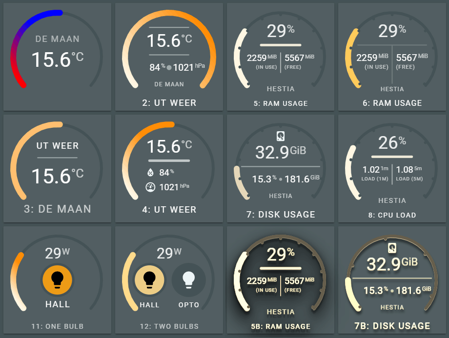
Some examples
Normal, flat UI
Cards in a standard vertical stack / horizontal stack - 2 cards per row - combination.

Legend:
- (3), showing a single attribute from a darksky sensor, a unit (temperature), an area and horizontal line
- (4), showing three attributes from a darksky sensor (temperature, humidity and air pressure), units, two icons, a name and a horizontal line
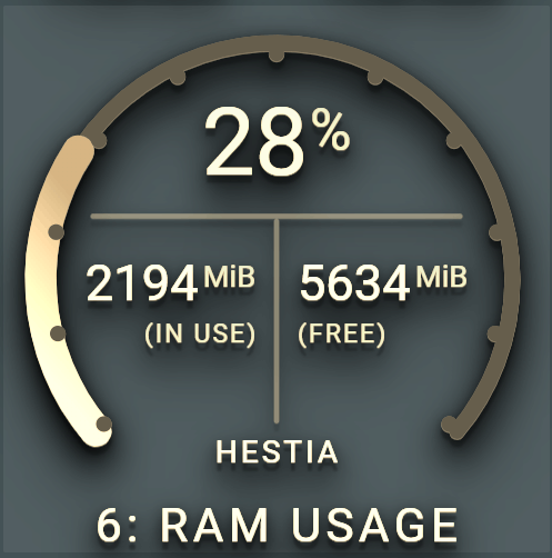
- (5), showing three sensors from system monitoring (ram used, ram used percentage and ram free), two sensor names ("in use" and "free"), a horizontal line and a vertical line.
- (6), same as (5), bit with different horizontal and vertical line and different fill style for the horseshoe.
All cards use different styling for filling the horseshoe with a color.
Some extreme, industrial look, 3D UI
Using the same cards as above, but with a predefined set of filters applied. In this case the card--dropshadow-heavy--sepia90 class filter for the card_filter variable.
Again, cards in a standard vertical stack / horizontal stack - 2 cards per row - combination.


It scales, as it is based on SVG
Using a single card in a row. Card scales to maximum width of the vertical stack card. No changes required for text size, icons, lines and state & attribute values. All thanks to SVG.
Yes, you can interact with it. Switching lights is no problem!
For each entity a tap_action can be defined. The default is the known show-more info dialog. This can be changed in executing a service for instance.
Combined with animations and states, you can alter the appearance of objects. The card containts a list of predefined animations, or you just create your own!
Install
Install via HACS
Manual install
-
Download and copy
dist/flex-horseshoe-card.jsfrom github into yourconfig/wwwdirectory. -
If using the editor UI: Add a reference to
flex-horseshoe-card.jsinside yourui-lovelace.yamlor at the top of the raw config editor UI. -
If using yaml mode, add a reference in the resources.yaml file that is !included in your
ui-lovelac.yamlfile
resources:
  - url: /community/flex-horseshoe-card/flex-horseshoe-card.js
    type: module
Using the card
The preferred method of using this card is by decluttering card templates. You define the layout and default options in this template and use the template in your Lovelace config. This config stays clean this way: you only specify the entities, attributes, units and icons which are displayed according to the layout defined in the template.
The advice will become obvious once you scroll throught the list of card options :smile:
A basic example
This is the card 1 of the examples. It shows the basic definition for the flexible horseshoe card using the darksky sensor with the temperature attribute and its unit and decimals.

- type: 'custom:flex-horseshoe-card'
  entities:
    - entity: weather.dark_sky
      attribute: temperature
      decimals: 1
      unit: '°C'
      area: De Maan
  show:
    horseshoe_style: 'lineargradient'
  layout:
    states:
      # Refers to the first entity in the list, ie index 0
      # State value is positioned at (50%,60%) with a large font size
      # The size of the units are automatically calculated at 60% of the
      # state value font size and shifted upwards.
      # The default font color is the theme defined primary-text-color.
      - id: 0
        entity_index: 0
        xpos: 50
        ypos: 60
        styles:
          - font-size: 3.5em;
    areas:
      # Refers to the first entity in the list, ie index 1
      # Area value is positioned at (50%,35%) with font-size 1.5 and
      # an opacity of 80%.
      # The default font color is the theme defined primary-text-color.
      - id: 0
        entity_index: 0
        xpos: 50
        ypos: 35
        styles:
          - font-size: 1.5em;
          - opacity: 0.8;

  # Scale set to -10 to +40 degrees celcius
  horseshoe_scale:
    min: -10
    max: 40
  # color stop list with two colors. With the `lineargradient` fill style, only the
  # colors are used. The thresholds are ignored with this setting.
  color_stops:
    10: 'red'
    18: 'blue'
Extending the basic example with two more entities and a horizontal line
This is card 4 of the examples. It extends the basic definition of card 1 with two more attributes from the darksky sensor and adds a horizontal line as a divider. We also swap the area with the name of the first entity.

- type: 'custom:flex-horseshoe-card'
  entities:
    - entity: weather.dark_sky
      attribute: temperature
      decimals: 1
      name: '4: Ut Weer'
      unit: '°C'
    - entity: weather.dark_sky
      attribute: humidity
      decimals: 0
      unit: '%'
      icon: mdi:water-percent
    - entity: weather.dark_sky
      attribute: pressure
      decimals: 0
      unit: 'hPa'
      icon: mdi:gauge
  show:
    horseshoe_style: 'lineargradient'
  layout:
    hlines:
      # A horizontal line. Not connected to an entity
      - id: 0
        xpos: 50
        ypos: 42
        length: 40
        styles:
          - stroke: var(--primary-text-color);
          - stroke-width: 5;
          - stroke-linecap: round;
          - opacity: 0.7;
    states:
      # States 0 refers to the first entity in the list, ie index 0
      - id: 0
        entity_index: 0
        xpos: 50
        ypos: 34
        styles:
          - font-size: 3em;
      # States 1 refers to the second entity in the list, ie index 1
      - id: 1
        entity_index: 1
        xpos: 40
        ypos: 57
        styles:
          - text-anchor: start;
          - font-size: 1.5em;
      # States 2 refers to the third entity in the list, ie index 2
      - id: 2
        entity_index: 2
        xpos: 40
        ypos: 72
        styles:
          - text-anchor: start;
          - font-size: 1.5em;
    icons:
      # Icons 0 refers to the second entity in the list, ie index 1
      - id: 0
        entity_index: 1
        xpos: 37
        ypos: 57
        align: end
        size: 1.3
      # Icons 1 refers to the third entity in the list, ie index 2
      - id: 1
        entity_index: 2
        xpos: 37
        ypos: 72
        align: end
        size: 1.3
    names:
      # Names 0 refers to the first entity in the list, ie index 0
      - id: 0
        entity_index: 0
        xpos: 50
        ypos: 95

  # Scale set to -10 to +40 degrees celcius
  horseshoe_scale:
    min: -10
    max: 40
  # color stop list with 10 colors defined in the theme. With the `lineargradient` fill style, only the
  # first (16:) and last (25:) colors are used. The thresholds are ignored with this setting.
  color_stops:
    16: '#FFF6E3'
    17: '#FFE9B9'
    18: '#FFDA8A'
    19: '#FFCB5B'
    20: '#FFBF37'
    21: '#ffb414'
    22: '#FFAD12'
    23: '#FFA40E'
    24: '#FF9C0B'
    25: '#FF8C06'
Extending the basic example with a lot more options like actions and animations
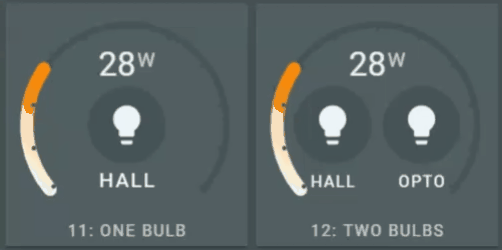
This is the card 12 of the examples. It displays the wattage (memory sensor is used for this value) and the state of two lights. Both ligts can be switched on and off. The left light uses a predefined animation (yello and zoomout), the right light uses a user defined animation.
Let's see how that looks :smile:

- type: 'custom:flex-horseshoe-card'
  entities:
    # Abuse the memory_use_percent sensor as the wattage the bulbs use. Just to show the possibilities
    - entity: sensor.memory_use_percent
      decimals: 0
      name: '12: Two Bulbs'
      area: Hestia
      unit: W
      decimals: 0
      tap_action:
        action: more-info

    # The left light displayed on the card. Index 1
    - entity: light.1st_floor_hall_light
      name: 'hall'
      icon: mdi:lightbulb
      tap_action:
        action: call-service
        service: light.toggle
        service_data: { "entity_id" : "light.1st_floor_hall_light" }

    # The right light displayed on the card. Index 2
    - entity: light.gledopto
      name: 'opto'
      icon: mdi:lightbulb
      tap_action:
        action: call-service
        service: light.toggle
        service_data: { "entity_id" : "light.gledopto" }

  animations:
    # Animations for the second entity, index 1
    entity.1:
      - state: 'on'
        circles:
          - animation_id: 11
            styles:
              - fill: var(--theme-gradient-color-03);
              - opacity: 0.9;
              - transform-origin: 30% 50%;
              - animation: jello 1s ease-in-out both;
        icons:
          - animation_id: 10
            styles:
              - fill: black;
      - state: 'off'
        circles:
          - animation_id: 11
            reuse: true
            styles:
              - transform-origin: 30% 50%;
              - animation: zoomOut 1s ease-out both;
        icons:
          - animation_id: 10
            styles:
              - fill: var(--primary-text-color);

    # Animations for the third entity, index 2
    entity.2:
      - state: 'on'
        circles:
          - animation_id: 21
            styles:
              - fill: var(--theme-gradient-color-03);
              - stroke-width: 2;
              - stroke: var(--primary-background-color);
              - opacity: 0.9;
              - stroke-dasharray: 94;
              - stroke-dashoffset: 1000;
              - animation: stroke 2s ease-out forwards;

        icons:
          - animation_id: 20
            styles:
              - fill: black;

      - state: 'off'
        circles:
          - animation_id: 21
            styles:
              - fill: var(--primary-background-color);
              - opacity: 0.7;
        icons:
          - animation_id: 20
            styles:
              - fill: var(--primary-text-color);

  show:
    horseshoe_style: 'fixed'
  layout:
    states:
      - id: 0
        entity_index: 0
        animation_id: 0
        xpos: 50
        ypos: 28
        uom_font_size: 1.5
        styles:
          - font-size: 2.5em;
          - opacity: 0.9;
    names:
      - id: 0
        animation_id: 0
        entity_index: 0
        xpos: 50
        ypos: 100
        styles:
          - font-size: 1.2em;
          - opacity: 0.7;
      - id: 1
        animation_id: 1
        entity_index: 1
        xpos: 30
        ypos: 78
        styles:
          - font-size: 1.2em;
      - id: 2
        animation_id: 2
        entity_index: 2
        xpos: 70
        ypos: 78
        styles:
          - font-size: 1.2em;
    icons:
      - id: 0
        animation_id: 10
        xpos: 30
        ypos: 55
        entity_index: 1
        icon_size: 3.5
        styles:
          - color: var(--primary-text-color);;
      - id: 1
        animation_id: 20
        xpos: 70
        ypos: 55
        entity_index: 2
        icon_size: 3.5
        styles:
          - color: var(--primary-text-color);;
    circles:
      - animation_id: 3
        xpos: 30
        ypos: 50
        radius: 35
        styles:
          - fill: var(--primary-background-color);
      - animation_id: 11
        xpos: 30
        ypos: 50
        radius: 30
        entity_index: 1

      - animation_id: 2
        xpos: 70
        ypos: 50
        radius: 35
        styles:
          - fill: var(--primary-background-color);
      - animation_id: 21
        xpos: 70
        ypos: 50
        radius: 30
        entity_index: 2

  horseshoe_scale:
    min: 0
    max: 100
    color: 'var(--primary-background-color)'
  horseshoe_state:
    color: '#FFDA8A'
  color_stops:
    0: '#FFF6E3'
    10: '#FFE9B9'
    20: '#FFDA8A'
    30: '#FFCB5B'
    40: '#FFBF37'
    50: '#ffb414'
    60: '#FFAD12'
    70: '#FFA40E'
    80: '#FF9C0B'
    90: '#FF8C06'
  # The @keyframes stroke runs the stroke animation for the second lightbulb, entity light.gledopto
  style: |
    @keyframes stroke { to { stroke-dashoffset: 0; } }
Card Options
Main Card required, defaulted and pure optional sections
The Card Options are divided into Sections. To give a clear overview of which of the sheer number of sections are required, optional with defaults and optional, the following table is made.
The examples section shows 12 examples of card definitions, from basic to using all available options!
Note: The examples will get decluttering templates as an example too, to show how you can better manage and maintain the all the card layouts without loosing overview in the Lovelace views.
Each section might have it's own required, defaulted and optional properties.
| Name | Required | Optional /w defaults | Optional | Since | Description |
|---|---|---|---|---|---|
| type | :material-horseshoe: | v0.8.0 | custom:flex-horseshoe-card. |
||
| entities | :material-horseshoe: | v0.8.0 | One or more sensor entities in a list. See entities section for requirements. | ||
| layout | :material-horseshoe: | v0.8.0 | You MUST of course specify where each item is positioned on the card. See available layout options for requirements. | ||
| horseshoe_scale | :material-horseshoe: | some | v0.8.0 | Specifies the scale configuration, like min, max, width and color of the scale. See horseshoe scale for requirements. | |
| color_stops | :material-horseshoe: | v0.8.0 | Set thresholds for horseshoe gradients and colormapping. See color stops for requirements. | ||
| horseshoe_state | :material-horseshoe: | v0.8.0 | Specifies the horseshoe width, and fixed color. See horseshoe state for requirements. | ||
| show | :material-horseshoe: | v0.8.0 | Determines what is shown, like the scale and the horseshoe style. See available show options for requirements. | ||
| card_filter | :material-horseshoe: | v0.8.0 | |||
| entities tap_action | :material-horseshoe: | v0.8.0 | How to respond to a mouse-click or tap. See available tap actions for requirements. | ||
| animations | :material-horseshoe: | v0.8.0 | You can specify animations / dynamic behaviour depending on the state of an entity. Circles, lines and icons can be controlled depending on the state of a given entity. See available animation options for requirements. |
:material-horseshoe: Entities section
Available entity options
| Name | Type | Default | Since | Description |
|---|---|---|---|---|
| attribute | string | optional | v0.8.0 | The attribute to be used for the entity. |
| unit | string | optional | v0.8.0 | Specifies the entity or attribute unit to be displayed. |
| decimals | number | optional | v0.8.0 | Specifies the decimals to format the entity or attribute value. |
| name | string | optional | v0.8.0 | Name used for entity or attribute. Overwrites the friendly_name attribute. |
| area | string | optional | v0.8.0 | Area used for entity or attribute. |
| tap_action | action object | optional | v0.8.0 | How to respond to a mouse-click or tap. See available tap actions for requirements. |
Example 1, displaying an entity:
entities:
  - entity: sensor.memory_use_percent
    decimals: 0
    icon: mdi:memory
    name: '5: RAM Usage'
    area: Hestia
Example 2, displaying an attribute:
entities:
  - entity: weather.dark_sky
    attribute: temperature
    units: '°C'
    icon: mdi:temperature
    decimals: 1
    name: 'Temperature'
Action object options
(changed to be identical to mini graph card)
| Name | Type | Default | Options | Since | Description |
|---|---|---|---|---|---|
| action | string | more-info |
more-info, navigate, call-service, none |
v0.8.0 | Action to perform |
| service | string | none | Any service | v0.8.0 | Service to call (e.g. media_player.toggle) when action is defined as call-service |
| service_data | object | none | Any service data | v0.8.0 | Service data to include with the service call (e.g. entity_id: media_player.office) |
| navigation_path | string | none | Any path | v0.8.0 | Path to navigate to (e.g. /lovelace/0/) when action is defined as navigate |
Example 3: a light switch:
entities:
  - entity: light.1st_floor_hall_light
    name: 'hall'
    icon: mdi:lightbulb
    tap_action:
      action: call-service
      service: light.toggle
      service_data: { 'entity_id': 'light.1st_floor_hall_light' }
Layout section
Available layout options
The layout options determine where the objects are located on the card, and their initial appearance like font, font size, color, width, fill color, stroke color, etc.
| Name | Type | Default | Since | Description |
|---|---|---|---|---|
| Layout object | layout object | required | v0.8.0 | Entity objects:
|
Layout object options
| Name | Type | Default | Options | Since | Description |
|---|---|---|---|---|---|
| id | number | not used yet | v0.8.0 | Identifies the object. | |
| xpos | percentage | required | percentage 0..100 | v0.8.0 | Relative x-position in card. A value of 50 (%) places the object in the middle of the x-axis |
| ypos | percentage | required | percentage 0..100 | v0.8.0 | Relative y-position in card. A value of 50 (%) places the object in the middle of the y-axis |
| length(lines only) | percentage | required | percentage 0.100 | v0.8.0 | Relative length of a line. A value of 50 (%) means the line is half the size of the card's width |
| radius(circles only) | pixels | required | > 1 / < 200 | v0.8.0 | Specifies the radius of the circle in pixels. |
| iconsize (icons only)_ | em value | required | a value of 1 = 12px | v0.8.0 | Specifies the size of the icon in em units. A calculation takes care of positioning the icon |
| align (icons only) | position | middle |
start/ middle/ end |
v0.8.0 | Specifies the alignment of the icon relative to the xpos and ypos. Functions idential to the text-anchorcss property. Used in positioning calculations for the icon. |
| entity_index | number | required | N/A | v0.8.0 | Refers to the 0-based index in the entity list which the layout is connected to |
| animation_id | number | optional | an Id | v0.8.0 | Identifies an animation in the animations section. It connects this layout object with dynamic behaviour |
| styles | list | optional | any valid css entry | v0.8.0 | specify a list of css values to style the object. Must be terminated with a semicolon ;.Since v5.4.1 the styles section supports JavaScript templates for dynamic behaviour based on states or other logic |
| color_stops | list | optional | N/A | v5.4.1 | specify a list of colors. The color of the object will change accordingly to the state of the entity |
Example layout entry
The following layout is a part of card 5. For more complete examples, see the examples section
- xpos, ypos and length are percentages
- state layout 0 is connected to entity 0, ie the first entity in the entities section
- name layout 0 is also connected to entity 0
layout:
  hlines:
    - id: 0
      xpos: 50
      ypos: 38
      length: 40
      styles:
        - stroke: var(--theme-gradient-color-01);
        - stroke-width: 5;
        - opacity: 0.9;
        - stroke-linecap: round;
  vlines:
    - id: 0
      xpos: 50
      ypos: 56
      length: 20
      styles:
        - stroke: white;
        - opacity: 0.5;
        - stroke-width: 2;
        - stroke-linecap: round;
  states:
    - id: 0
      entity_index: 0
      xpos: 50
      ypos: 30
      styles:
        - font-size: 3em;
        - opacity: 0.9;
  names:
    - id: 0
      entity_index: 0
      xpos: 50
      ypos: 100
      styles:
        - font-size: 1.2em;
Horseshoe section
Horseshoe scale options
| Name | Type | Default | Options | Since | Description |
|---|---|---|---|---|---|
| min | number | required | v0.8.0 | Minimum value of the scale / horseshoe | |
| max | number | required | v0.8.0 | Maximum value of the scale / horseshoe | |
| color | color | var(--primary-background-color) |
any # or var color | v0.8.0 | Color of the scale and tickmarks, if enabled through show.scale_tickmarks option. |
| width | pixels | 6 | size in pixels | v0.8.0 | Width of scale |
| bar_mode | string | normal |
normal, bidirectional |
5.4.3 | Horseshoe can go "bidirectionally" CV and CCW from the top/center which is always 0 |
Example:
horseshoe_scale:
  min: 0
  max: 100
  width: 6
  color: 'var(--primary-background-color)'
Bidrectional Example (thanks to @Ndrinta):

type: custom:flex-horseshoe-card
view_layout:
  grid-area: block1
entities:
  - entity: sensor.grid_ct_w
    decimals: 0
    unit: W
    name: GRID
  - entity: sensor.grid_daily
    decimals: 1
    unit: kWh
    icon: mdi:transmission-tower-export
  - entity: sensor.feed_in_energy_today
    decimals: 1
    unit: kWh
    icon: mdi:transmission-tower-import
show:
  horseshoe_style: colorstopgradient
layout:
  hlines:
    - id: 0
      xpos: 50
      ypos: 42
      length: 40
      styles:
        - stroke: grey;
        - stroke-width: 5;
        - stroke-linecap: round;
        - opacity: 0.7;
  states:
    - id: 0
      entity_index: 0
      xpos: 50
      ypos: 34
      styles:
        - font-size: 3em;
    - id: 1
      entity_index: 1
      xpos: 40
      ypos: 57
      styles:
        - text-anchor: start;
        - font-size: 1.7em;
    - id: 2
      entity_index: 2
      xpos: 40
      ypos: 72
      styles:
        - text-anchor: start;
        - font-size: 1.7em;
  icons:
    - id: 0
      entity_index: 1
      xpos: 37
      ypos: 57
      align: end
      size: 1.3
    - id: 1
      entity_index: 2
      xpos: 37
      ypos: 72
      align: end
      size: 1.3
  names:
    - id: 0
      entity_index: 0
      xpos: 50
      ypos: 95
horseshoe_scale:
  min: -6500
  max: 6500
  color: lightgrey
bar_mode: bidirectional
color_stops:
  '0': var(--energy-grid-consumption-color)
  '100': var(--energy-grid-return-color)
Horseshoe state options
| Name | Type | Default | Options | Since | Description |
|---|---|---|---|---|---|
| color | color | required | any valid color | v0.8.0 | Color of horseshoe if show.horseshoe_style = fixed |
| width | pixels | 12 | size in pixels | v0.8.0 | Width of horseshoe |
Example:
horseshoe_state:
  width: 12
  color: 'var(--theme-gradient-color-01)'
Horseshoe color stops
| Name | Type | Default | Options | Since | Description |
|---|---|---|---|---|---|
| color_stops | list | required | v0.8.0 | List of colorstop value and colors. Colors can be specified using:
|
Example:
Showing a list of colorstop thresholds (0..90) and the colorstop colors, in this case a gradient colorlist from the theme
color_stops:
  0: 'var(--theme-gradient-color-01)'
  10: 'var(--theme-gradient-color-02)'
  20: 'var(--theme-gradient-color-03)'
  30: 'var(--theme-gradient-color-04)'
  40: 'var(--theme-gradient-color-05)'
  50: 'var(--theme-gradient-color-06)'
  60: 'var(--theme-gradient-color-07)'
  70: 'var(--theme-gradient-color-08)'
  80: 'var(--theme-gradient-color-09)'
  90: 'var(--theme-gradient-color-10)'
Horseshoe fill styles
The horseshoe can be filled in different ways. Almost all use the color_stop colors to determine the color of the horseshoe. Not all use the actual color_stop thresholds to determine the color, but just use the color_stop colors.
The next table describes how the fill styles work:
| Option | Requires | uses color_stop threshold | Uses entity value | Since | Description |
|---|---|---|---|---|---|
| autominmax | color_stops list with at least 2 values |
uses min and max of scale |
:material-horseshoe: | v0.8.0 | Autominmax uses the min and max values to calculate a gradient color using the first and last color in the colorstop list and the actual value of the entity or attribute. |
| fixed | horseshoe_state .color |
v0.8.0 | Fills the shoe with a single color | ||
| colorstop | color_stops list with at least 2 values |
:material-horseshoe: | :material-horseshoe: | v0.8.0 | Fills the shoe with the colorstop color depending on the colorstop value and the value of the state |
| colorstopgradient | color_stops list with at least 2 values |
:material-horseshoe: | :material-horseshoe: | v0.8.0 | Same as colorstop, but a gradient is used between colorstops |
| lineargradient | color_stops list with at least 2 values |
v0.8.0 | Uses the first and last entry in the color_stops list to display a linear gradient. It always shows the full gradient from start to end color, independent of the states value. |
The fill style is set in the show section of the card:
show:
  horseshoe_style: 'lineargradient'
Animations section
Available animation options
Animations are optional, and are driven by state changes of a given entity or attribute.
| Name | Type | Default | Since | Description |
|---|---|---|---|---|
| entity. |
string | required | v0.8.0 | Entity index (zero based) which triggers the animation. In the form of entity.1 for the SECOND entity in the entity list. If an attribute is specified, the attribute triggers the animation. |
| state | string | required | v0.8.0 | specifies the state like 'on', or 'off' the animation is meant for |
| circles, hlines, vlines, icons | list | required | v0.8.0 | list of objects with animations |
Available circle, hline, vline, icon animation styles
| Name | Type | Default | Since | Description |
|---|---|---|---|---|
| animation_id | number | required | v0.8.0 | the unique (for this card) animation_id. Is also referred to by the layout. |
| styles | css properties list | required | v0.8.0 | list of pure css styles for this object. MUST contain a ';' at the end of the line! |
| reuse | boolean | false |
v0.8.0 | Default the previous animation style is cleared. By setting reuse to true, the previous animation style is preserved by the new animation. This can be handy if this animation starts where the previous animation left off. For instance a color: the 'on' state sets the circle to orange. The 'off' state keeps the color, but zooms out. |
| icon | string | false |
v5.4.4 | Name of Icon to change. |
Predefined animations
| Name | Type | Since | Example definition in the styles section of the animation |
|---|---|---|---|
| bounce | attention | v0.8.0 | styles:- animation: bounce 1s ease-in-out both;- transform-origin: center bottom; |
| flash | attention | v0.8.0 | styles:- animation: flash 1s ease-in-out both;- transform-origin: center; |
| headShake | attention | v0.8.0 | styles:- animation: headShake 1s ease-in-out both;- transform-origin: center; |
| heartBeat | attention | v0.8.0 | styles:- animation: heartBeat 1.3s ease-in-out both;- transform-origin: center; |
| jello | attention | v0.8.0 | styles:- animation: jello 1s ease-in-out both;- transform-origin: center; |
| pulse | attention | v0.8.0 | styles:- animation: pulse 1s ease-in-out both;- transform-origin: center; |
| rubberBand | attention | v0.8.0 | styles:- animation: rubberBand 1s ease-in-out both;- transform-origin: center; |
| shake | attention | v0.8.0 | styles:- animation: shake 1s ease-in-out both;- transform-origin: center; |
| swing | attention | v0.8.0 | styles:- animation: swing 1s ease-in-out both;- transform-origin: top center; |
| tada | attention | v0.8.0 | styles:- animation: tada 1s ease-in-out both;- transform-origin: center; |
| wobble | attention | v0.8.0 | styles:- animation: wobble 1s ease-in-out both;- transform-origin: center; |
| zoomOut | zooming | v0.8.0 | styles:- animation: zoomOut 1s ease-out both;- transform-origin: center; |
| zoomIn | zooming | v0.8.0 | styles:- animation: zoomIn 1s ease-out both;- transform-origin: center; |
Example of animation for card 11:
- type: 'custom:flex-horseshoe-card'
  entities:
    - entity: sensor.memory_use_percent
    - entity: light.1st_floor_hall_light
  animations:
    entity.1:
      - state: 'on'
        circles:
          - animation_id: 10
            styles:
              - fill: var(--theme-gradient-color-08);
              - opacity: 0.9;
              - animation: jello 1s ease-in-out both;
              - transform-origin: center;
        icons:
          - animation_id: 0
            styles:
              - fill: black;
      - state: 'off'
        circles:
          - animation_id: 10
            reuse: true
            styles:
              - transform-origin: center;
              - animation: zoomOut 1s ease-out both;
        icons:
          - animation_id: 0
            styles:
              - fill: var(--primary-text-color);
User defined animations
You can define your own animations too. Pick a unique name, add the animation to the style: section of the card, and off you go. Example Card 12, the bulb named "OPTO" has such a user defined animation: you see something running around if the light is switched on.
There are at least a few great places for example animations:
- CSS animations for beginners
- Animate.css, where the predefined animations come from!
- The interactive site from Ana Travis, Animista. A great site for creating all sorts of animations.
Example of Card 12
- type: 'custom:flex-horseshoe-card'
  entities:
    - entity: sensor.memory_use_percent
    - entity: light.1st_floor_hall_light
    - entity: light.gledopto

  animations:
    entity.2:
      - state: 'on'
        circles:
          - animation_id: 3
            styles:
              - fill: var(--theme-gradient-color-03);
              - stroke-width: 2;
              - stroke: var(--primary-background-color);
              - opacity: 0.9;
              - stroke-dasharray: 94;
              - stroke-dashoffset: 1000;
              - animation: stroke 2s ease-out forwards;

        icons:
          - animation_id: 1
            styles:
              - fill: black;

      - state: 'off'
        circles:
          - animation_id: 3
            styles:
              - fill: var(--primary-background-color);
              - opacity: 0.7;
        icons:
          - animation_id: 1
            styles:
              - fill: var(--primary-text-color);
  # The @keyframes stroke runs the stroke animation for the second lightbulb, entity light.gledopto
  style: |
    ha-card {
      box-shadow: var(--theme-card-box-shadow);
    }
    @keyframes stroke { to { stroke-dashoffset: 0; } }
Card Styling section
As of v5.4.1
You can styule the (background) of the card using CSS styles.
The first example shows how to add an image, and center it.
- type: 'custom:flex-horseshoe-card'
  entities:
    - entity: sensor.memory_use_percent
    - entity: light.1st_floor_hall_light

  styles:
    - background-color: rgba(20, 20, 20, 0.05);
    - background-image: url('/local/images/backgrounds/pollen-background-hd-3x1.png');
    - background-size: cover;
    - background-position: center;
    - background-repeat: no-repeat;
    - overflow: hidden;
The second example shows the combination of card style and JavaScript templating.
The background color is changed - in this case - depending on the state of entity_index 0.
- type: 'custom:flex-horseshoe-card'
  entities:
    - entity: sensor.memory_use_percent
    - entity: light.1st_floor_hall_light

  styles:
    - background-color: |
        [[[
          const value = Number(state);
          return value >= 5
            ? 'var(--error-color);'
            : 'var(--primary-text-color);';
        ]]]
    - transition: background-color 1s ease-in-out;
Colorstops for states, icons etc section
As of v5.4.1
This example shows how to to define a colorstop for an entity. The first one is a state, the second one an area.
In both cases, the numeric state of the entity determines the color.
- type: 'custom:flex-horseshoe-card'
  entities:
    - entity: sensor.memory_use_percent
    - entity: light.1st_floor_hall_light

  states:
    - id: 0
      entity_index: 0
      xpos: 50
      ypos: 30
      styles:
        - font-size: 3em;
      color_stops:
        0: 'blue'
        1: 'green'
        2: 'yellow'
        3: 'orange'
        4: 'red'
        5: 'purple'

  areas:
    - id: 0
      entity_index: 0
      xpos: 50
      ypos: 85
      styles:
        - font-size: 1.2em;
      color_stops:
        0: 'blue'
        1: 'green'
        2: 'yellow'
        3: 'orange'
        4: 'red'
        5: 'purple'
JavaScript Templates section
As of v5.4.1
Support for JavaScript templates in the styles section to get dynamic styling based on entity or attribute values.
The following variables are availeble in the JavaScript part:
| Variable | Description |
|---|---|
state |
State of entity |
states |
All the state values from hass: index them with the name of the sensor, ie states[sensor.my-sensor] for instance |
variables |
Reference to re=usable templates, ie [[[ return variables['testColorStops']; ]]] for instance |
The example shows that the fill of an entities name depends on the value of the state.
If state >= 4 then fill = error-color, else primary-text-color
names:
  - id: 0
    entity_index: 0
    xpos: 50
    ypos: 100
    styles:
      - font-size: 1.2em;
      - fill: |
          [[[
            const value = Number(state);
            return value >= 4
              ? 'var(--error-color);'
              : 'var(--primary-text-color);';
          ]]]
Using states to evaluate a color. If state < 0 then some red color, else green color.
names:
  - id: 0
    entity_index: 0
    xpos: 50
    ypos: 100
    styles:
      - font-size: 1.2em;
      - fill: |
          [[[
            const v = Number(states['sensor.battery_power'].state);
            if (v < 0) return '#ff4d4d';
            if (v > 0) return '#00c853';
            return 'var(--primary-text-color)';
          ]]]
Using variables to re-use templates.
- type: custom:flex-horseshoe-card
  entities:
    - entity: sensor.dsmr_reading_phase_currently_delivered_l1
      decimals: 2
      name: 'L1'
    - entity: sensor.dsmr_reading_phase_currently_delivered_l2
      decimals: 2
      name: 'L2'
    - entity: sensor.dsmr_reading_phase_currently_delivered_l3
      decimals: 2
      name: 'L3'
    - entity: sensor.dsmr_reading_electricity_currently_delivered
      decimals: 2
      name: 'All'
      # Change icon depending on state of this entity
      icon: |
        [[[
          const value = Number(state);
          return value >= 0.4
            ? 'mdi:flash'
            : 'mdi:flash-off';
        ]]]
    - entity: sensor.dsmr_reading_electricity_currently_delivered
      decimals: 2
    - entity: light.livingroom_light_duo_left_light
      name: 'extra hall'
      icon: mdi:lightbulb
  variables:
    # Flash if state > 0.3. 3 times for 1 second
    flashAnimation: |
      [[[
        const value = Number(state);
        return value >= 0.3
          ? 'flash 1s ease-in-out 3'
          : 'none';
      ]]]
    # Color stop template containing nested templates
    testColorStops: |
      [[[
        return {
          0: 'black',
          0.1: `[[[ return 'hotpink'; ]]]`,
          0.5: 'yellow',
          1: 'orange',
          3: `[[[ return 'red'; ]]]`,
          5: `[[[ return 'purple'; ]]]`,
        };
        ]]]
    # Color stop definition defined fully by JavaScript template
    testColorStops2: |
      [[[
        return {
          0: 'blue',
          0.1: 'green',
          0.5: 'yellow',
          1: 'orange',
          3: 'red',
          5: 'purple',
        };
      ]]]
    # Full YAML definition of a colorstop
    testColorStops3:
      0: 'blue'
      0.1: 'green'
      0.5: 'yellow'
      1: 'orange'
      3: 'red'
      5: 'purple'
and using them:
horseshoes:
  - entity_index: 3
    xpos: 75
    ypos: 69
    radius: 20
    tickmarks_radius: 18
    arc_degrees: 300
    show:
      horseshoe: true
      scale_tickmarks: true
      horseshoe_style: colorstop
    horseshoe_scale:
      min: 0
      max: 5
      width: 6
      color: var(--secondary-background-color)
      ticksize: 1
    horseshoe_state:
      width: 12
      styles:
        - animation: |
            [[[
              return variables['flashAnimation'];
            ]]]
    color_stops: |
      [[[ return variables['testColorStops3']; ]]]
Show section
Available show options
All options are optional.
| Name | Default | Parameter | Since | Description |
|---|---|---|---|---|
| scale_tickmarks | true | true / false |
v0.8.0 | Display scale |
| horseshoe_style | autominmax |
fixed / autominmax/ colorstop / colorstopgradient/ lineargradient |
v0.8.0 | Fill style. Most fill styles need the colorstop list to be specified. See horseshoe fill style list for a description. |
Card Filter section
There are some predefined css filters which you can use to give the full card a different look. Besides the predefined, you can also define you rown using the style: section of the yaml card definition and refer to that class as the card_filter:
| Name | Default | Parameter | Since | Description |
|---|---|---|---|---|
| card_filter | card--dropshadow-none |
card--dropshadow-none/ card--dropshadow-medium--opaque--sepia90 / card--dropshadow-heavy--sepia90 / card--dropshadow-heavy / card--dropshadow-medium--sepia90/ card--dropshadow-medium / card--dropshadow-light--sepia90 / card--dropshadow-light / card--dropshadow-down-and-distant |
v0.8.0 | List of drop-shadows and sepia colorization using css filters on the full card.Currently only tested on the darkslategrey / wheat Nyx theme |
Examples section
The full view with all 12 examples is in the examples folder of this repository.
Three examples are included in this readme for easy access. Most examples use the Darksy sensor or the Home Assistant system monitor. A few use lights, which you have to replace with your own of course.
Furthermore, theme defined variables are used:
theme-card-box-shadow: 'var(--shadow-elevation-2dp_-_box-shadow)'and:
theme-gradient-color-01: '#FFF6E3'
theme-gradient-color-02: '#FFE9B9'
theme-gradient-color-03: '#FFDA8A'
theme-gradient-color-04: '#FFCB5B'
theme-gradient-color-05: '#FFBF37'
theme-gradient-color-06: '#ffb414'
theme-gradient-color-07: '#FFAD12'
theme-gradient-color-08: '#FFA40E'
theme-gradient-color-09: '#FF9C0B'
theme-gradient-color-10: '#FF8C06'
theme-gradient-color-11: '#FF8305'
Define your own, or alter the example cards!
Design your OWN card
I hope you have found enough examples and inspiration to design your own horseshoe layout, with nice colors and functional animations. I just might include some of the community designs in this section :smile:
End notes
License
This project is under the MIT license.
Credits
The making of this card wouldn't be possible without an incredible number of resources I used to find solutions for the things I wanted to do with this card. Credits in random order:
- The Home Assitant dev site with a simple example of creating a lit-element card
- Implementation examples from the community like the mini-graph-card, button-card and gauge-card
- The greatest site for CSS, css-tricks
- The back-to-school site for HTML, CSS and Javascript: w3schools
- Stackoverflow for so many solutions for specific problems
- Codepen for so many, many, many small CSS, SVG and HTML examples for things I didn't now how they worked
- jsfiddle for so many, many, many small CSS, SVG and HTML examples for things I didn't now how they worked
- designshack for all sorts of inspirations & designs
- pinterest for color palettes and more
- CSS animations for beginners
- Animate.css, where the predefined animations come from!
- The interactive site from Ana Travis, Animista for all your animations.
- The Material design palette generator which saved me a lot of time.
- An RGB Color Gradient Maker
Personal Note
Many, many, many years ago in the last century I learned to code C and Pascal. To make this card I had to learn the basics of a lot of new things like Javascript, HTML, CSS and the lit-element web component. The above resources where invaluable to accomplish this.