
🚀 Launch UI – Next.js Website Components Template
A comprehensive collection of production-ready website components built with Next.js, Shadcn/ui, and Tailwind CSS. Perfect for developers looking to quickly build modern, responsive websites with the power of shadcn/ui components.




[!TIP] Tailwind v4 + React 19: Launch UI v2.0 adds full support for Tailwind v4, React 19 and Next.js 16. If you're using Tailwind 3, a version that supports it is still maintained on a separate branch.
🚀 Quick Start
- Install dependencies:
npm install
- Start the development server:
npm run dev
- Open http://localhost:3000 to view your site
📚 Resources
✨ Features
- 🎨 Modern Design System: Built on top of shadcn/ui, offering a clean and professional look
- 📱 Fully Responsive: All components work perfectly across desktop, tablet, and mobile devices
- ⚡ Performance Optimized: Leverages modern Next.js features for optimal loading speed
- 🌗 Dark Mode Support: Seamless light/dark mode switching with system preference detection
- ♿ Accessibility First: WCAG compliant components for inclusive web experiences
- 🎯 SEO Optimized: Built with best practices for search engine visibility
🧱 Components
Included
- Navbar: Modern navigation component with multiple variants including static and floating styles. Features dropdown menus, mobile responsiveness, and seamless dark mode support
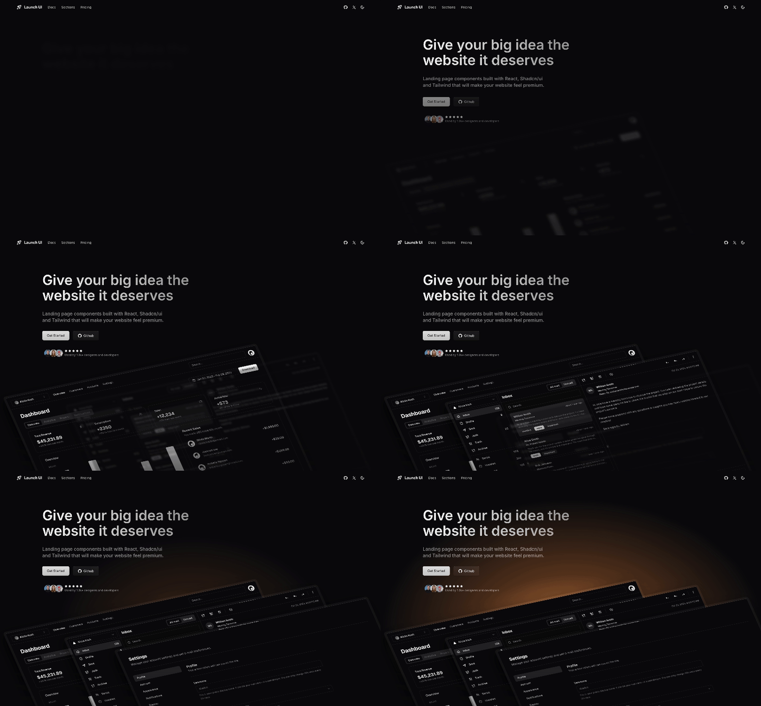
- Hero: Stunning hero sections with multiple variants including illustration-based layouts, glowing effects, and mobile app showcases. Built for strong first impressions and effective message delivery
- Items: Flexible grid system for feature lists, pricing tables, and product showcases. Includes both default and branded variants with responsive layouts
- Logos: Clean logo showcase component with static grid layout. Perfect for displaying brand partnerships and client logos with consistent styling
- FAQ: Comprehensive FAQ component with expandable accordions. Features smooth animations and responsive design for optimal user experience
- Stats: Versatile statistics display component with horizontal, tiles, and grid layouts. Perfect for showcasing statistics, big numbers, key metrics and data points
- CTA: Powerful call-to-action component with multiple styles including box layouts and beam effects. Designed to create compelling sections that drive user engagement
- Footer: Versatile footer with multiple layout variants including default, minimal, and multi-column styles. Perfect for organizing site information and links
In Pro version
- Bento Grid: Advanced masonry-style grid system for creating visually appealing content arrangements. Perfect for showcasing features, products, or content in an elegant, card-based layout
- Feature: Sophisticated feature showcase with flexible illustration placements and mockup displays. Includes multiple layout options while maintaining shadcn's consistent design language
- Social Proof: Advanced social proof displays with masonry layouts, marquee animations, and clickable cards. Built for showcasing user feedback in engaging ways
- Tabs: Fully customizable tabs with left, top, and bottom alignments. Built with accessibility in mind for seamless content organization
- Carousel: Dynamic carousel component with multiple variants. Features smooth animations, responsive design, and customizable navigation controls
- Testimonials: Comprehensive testimonials component with grid layouts, carousels, and static displays. Designed for beautiful, accessible customer feedback showcases
🛠️ Tech Stack
- Framework: Next.js 16
- Styling: Tailwind CSS
- UI Components: shadcn/ui
- Language: TypeScript
- Animations: CSS animations and transitions
- Icons: Lucide icons
💡 Use Cases
Launch UI was made for products that need a great-looking, conversion-optimized landing page that speaks to professional quality-oriented audiences.
Perfect for building landing pages for:
- 🛠️ Developer Tools: Present APIs, SDKs, CLI tools, and technical infrastructure products
- 🤖 AI-Powered Applications: Showcase products made with AI, assistants, agents and automation tools
- 💻 SaaS Products: Launch web applications, productivity tools, and business solutions
- 📱 Mobile Apps: Promote iOS and Android applications with beautiful app showcases
- 🚀 Startup Products: Perfect for indie hackers, solo founders, and technical startups
- ⚡ Technical Products: Ideal for technical products, development tools, and programming software
📝 License
This repository is licensed under the MIT License.