

Pxlkit
Bring retro aesthetics to the modern web — and build 3D voxel games with React.
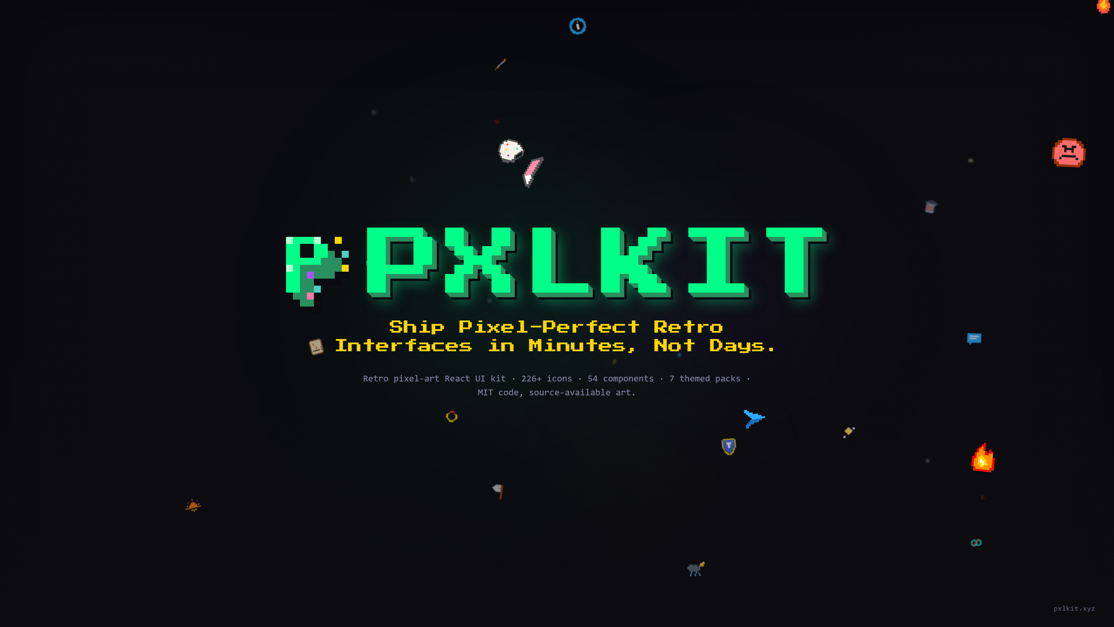
Pxlkit is a comprehensive source-available React toolkit featuring 226+ pixel art SVG icons across 7 themed packs (10 npm packages total including the code packages), 57 retro UI components, interactive 3D parallax icons, animated SVGs, a visual icon builder, toast notifications, and @pxlkit/voxel — an MIT-licensed 3D voxel toolkit on Three.js & React Three Fiber. The showcase app at pxlkit.xyz/explore ships procedural world generation, biomes, day/night cycles, and chunk-based terrain streaming.
Overview
Pxlkit.xyz is a monorepo containing 226+ pixel art icons organized into 7 themed packs, a retro React UI kit with 57 components, a core rendering engine, a 3D voxel toolkit (with a procedural world engine running live at /explore), and a Next.js 15 showcase website. Every icon is a 16×16 character grid mapped to a color palette — designed to be hand-editable, AI-generatable, and version-control friendly. Browse and visually edit them at the official website.
pxlkit/
├── packages/
│   ├── core/           → Types, React components, SVG utilities
│   ├── ui-kit/         → 57 retro pixel art React UI components
│   ├── gamification/   → 51 icons — RPG, achievements, rewards
│   ├── feedback/       → 33 icons — alerts, status, notifications
│   ├── social/         → 43 icons — community, emojis, messaging
│   ├── weather/        → 36 icons — climate, moon phases, temperature
│   ├── ui/             → 41 icons — interface controls, navigation
│   ├── effects/        → 12 icons — animated VFX, particles
│   ├── parallax/       → 10 icons — multi-layer 3D parallax
│   └── voxel/          → 3D voxel game engine (Three.js + R3F)
└── apps/
    └── web/            → Next.js 15 showcase & documentation site
Recently Shipped
| Version | Highlights |
|---|---|
@pxlkit/ui-kit v1.5.0 |
forwardRef wired across every interactive primitive, full a11y pass (ARIA + focus rings + keyboard handlers), and PixelToast + PxlKitToastProvider shipped inside the kit. |
@pxlkit/ui v1.2.5 |
UI-pack refinement pass — 10 icons redrawn for legibility (settings, dots-menu, history, eraser, paint-bucket, chain-link, copy, edit, gear, lock-open). |
@pxlkit/social v1.2.4 |
Social-pack refinement pass — thumbs, at-sign, star-face, surprise, angry, and more rebuilt for face-family coherence. |
@pxlkit/weather v1.2.4 |
Weather-pack refinement pass — 4 icons redrawn for clarity at 16 px. |
@pxlkit/ui-kit v1.4.0 |
Switchable surface aesthetic (pixel ↔ linear) on every component via PxlKitSurfaceProvider. |
See CHANGELOG.md for the full release history.
Licensing Model
@pxlkit/core,@pxlkit/ui-kit, and@pxlkit/voxelare MIT-licensed code packages.- The icon-pack packages and visual assets are source-available under
LICENSE-ASSETS: free with attribution, with paid no-attribution terms inCOMMERCIAL_TERMS. - The
Pxlkitname, logos, and brand presentation are covered byTRADEMARK_POLICY. - Third-party software and hosted fonts are listed in
THIRD_PARTY_NOTICES.
Icon Packs
| Pack | Package | Static | Animated | Total | Description |
|---|---|---|---|---|---|
| Gamification | @pxlkit/gamification |
41 | 10 | 51 | Trophies, swords, potions, RPG gear, coins |
| Feedback | @pxlkit/feedback |
30 | 3 | 33 | Checkmarks, alerts, shields, bugs, badges |
| Social | @pxlkit/social |
35 | 8 | 43 | Emojis, users, messages, hearts, reactions |
| Weather | @pxlkit/weather |
30 | 6 | 36 | Sun, moon, storms, temperature, night sky |
| UI | @pxlkit/ui |
36 | 5 | 41 | Home, search, settings, navigation, layout |
| Effects | @pxlkit/effects |
0 | 12 | 12 | Explosions, radar ping, flame, shockwave |
| Parallax | @pxlkit/parallax |
— | — | 10 | Multi-layer 3D parallax icons (3–5 layers) |
@pxlkit/voxel — MIT-Licensed 3D Voxel Toolkit 🎮
Status: v0.1.x — early preview. The published npm package today exposes voxel utility primitives. The full procedural-world engine lives in this repo's showcase app and is being prepared for the v1 release.
@pxlkit/voxel is an MIT-licensed 3D voxel toolkit built on Three.js and React Three Fiber. The current package ships:
pxlToVoxels(icon, options)— convert anyPxlKitData16×16 icon into an array ofVoxel { x, y, z, color }, with optionalscaleandextrudeDepthfor thickness.upscaleGrid(grid, factor)— upscale a pixel grid before voxelization for higher-resolution voxel models.- Types —
Voxel,VoxelData,VoxelConvertOptions. VoxelBomb— sample voxel icon for testing renderers.
Live preview engine — /explore
The procedural city engine you can fly through at pxlkit.xyz/explore lives in apps/web/src/components/procedural-terrain/. It uses the published @pxlkit/voxel primitives plus app-local R3F code:
- 🌍 Procedural world generation — seeded Perlin / fractal Brownian motion
- 🏔️ Continent + biome system — plains, desert, tundra, forest, mountains, ocean, city, swamp, village (with continent-level elevation modifiers)
- 🏗️ Chunk-based streaming — 16×16 chunks load dynamically with frustum culling and fog-color fade-in
- 🌅 Day/night cycle — 12-keyframe sun/moon/sky interpolation with animated window lights at night
- 🏙️ Procedural cities — 20+ building types, 5 zoning types, multi-lot buildings, avenues, inter-biome highways with tunnels and bridges
- 🚣 Dynamic entities — boats on water, sky birds, ground critters, ambient weather particles
- 🎮 Fly camera — pointer-lock controls with configurable speed
- 🗺️ Game HUD — minimap, fullscreen map, compass, FPS counter, settings panel (built with
@pxlkit/ui-kit) - ⚡ Built for
@react-three/fiber9.x +@react-three/drei10.x
Roadmap (toward v1 — when the showcase engine gets packaged)
- Promote chunk / biome / city modules into
packages/voxel/src/so consumers cannpm install @pxlkit/voxeland get the full engine. - Physics engine integration (collision detection, rigid bodies).
- NPC system with behavior trees and pathfinding.
- Inventory and item management.
- Multiplayer support via WebSockets.
- Sound engine with spatial audio.
- Modular entity-component system.
Quick Start
Install
npm install @pxlkit/core @pxlkit/gamificationInstall only the packs you need:
npm install @pxlkit/core @pxlkit/feedback @pxlkit/socialFor parallax 3D icons:
npm install @pxlkit/core @pxlkit/parallaxUse in React
import { PxlKitIcon } from '@pxlkit/core';
import { Trophy } from '@pxlkit/gamification';

// Default — original artwork palette
<PxlKitIcon icon={Trophy} size={32} />

// Tinted — preserves detail (highlights/shadows) while shifting hue
<PxlKitIcon icon={Trophy} size={32} appearance="tinted" color="#FF4D4D" />

// Solid — flatten every pixel to one colour
<PxlKitIcon icon={Trophy} size={32} appearance="solid" color="#FFFFFF" />
Icons are rendered as <img> elements backed by an inline SVG data URI with image-rendering: pixelated — every source pixel is preserved at every visual size, no edge dropouts at non-integer scales.
Animated Icons
import { AnimatedPxlKitIcon } from '@pxlkit/core';
import { FireSword } from '@pxlkit/gamification';

// Auto-playing loop (default — full palette)
<AnimatedPxlKitIcon icon={FireSword} size={48} />

// Play on hover only
<AnimatedPxlKitIcon icon={FireSword} size={48} trigger="hover" />

// Half speed
<AnimatedPxlKitIcon icon={FireSword} size={48} speed={0.5} />

// Tinted to match a UI tone, detail intact
<AnimatedPxlKitIcon icon={FireSword} size={48} appearance="tinted" color="#8237C8" />
Parallax 3D Icons
import { ParallaxPxlKitIcon } from '@pxlkit/core';
import { CoolEmoji } from '@pxlkit/parallax';

// Interactive parallax — layers move with mouse
<ParallaxPxlKitIcon icon={CoolEmoji} size={64} />

// Custom depth strength and perspective
<ParallaxPxlKitIcon icon={CoolEmoji} size={96} strength={24} perspective={300} />

// Non-interactive (static 3D)
<ParallaxPxlKitIcon icon={CoolEmoji} size={64} interactive={false} />
Toast Notifications
import { PixelToast } from "@pxlkit/core";
import { CheckCircle } from "@pxlkit/feedback";

<PixelToast
  visible={true}
  title="Saved!"
  message="Your changes have been saved."
  icon={CheckCircle}
  colorfulIcon
  position="bottom-right"
  duration={3000}
/>;
Browse Full Pack
import { GamificationPack } from "@pxlkit/gamification";
import { PxlKitIcon, AnimatedPxlKitIcon, isAnimatedIcon } from "@pxlkit/core";

{
  GamificationPack.icons.map((icon) =>
    isAnimatedIcon(icon) ? (
      <AnimatedPxlKitIcon key={icon.name} icon={icon} size={32} />
    ) : (
      <PxlKitIcon key={icon.name} icon={icon} size={32} />
    ),
  );
}
How Icons Work
Every icon is a 16×16 character grid paired with a palette that maps single characters to hex colors. The . character is always transparent.
import type { PxlKitData } from "@pxlkit/core";

export const Trophy: PxlKitData = {
  name: "trophy",
  size: 16,
  category: "gamification",
  grid: [
    "................",
    "..GGGGGGGGGGGG..",
    ".GG.YYYYYYYY.GG.",
    ".G..YYYYYYYY..G.",
    ".G..YYYWYYYY..G.",
    ".GG.YYYYYYYY.GG.",
    "..GGGGGGGGGGGG..",
    "....GGGGGGGG....",
    ".....GGGGGG.....",
    "......GGGG......",
    "......GGGG......",
    ".....DDDDDD.....",
    "....DDDDDDDD....",
    "....BBBBBBBB....",
    "...BBBBBBBBBB...",
    "................",
  ],
  palette: {
    G: "#FFD700", // Gold
    Y: "#FFF44F", // Yellow highlight
    D: "#B8860B", // Dark gold
    B: "#8B4513", // Brown base
    W: "#FFFFFF", // White shine
  },
  tags: ["achievement", "winner", "reward"],
  author: "pxlkit",
};
Animated icons use multiple frames with the same grid format:
import type { AnimatedPxlKitData } from "@pxlkit/core";

export const FireSword: AnimatedPxlKitData = {
  name: "fire-sword",
  size: 16,
  category: "gamification",
  palette: { S: "#C0C0C0", F: "#FF4500" },
  frames: [
    {
      grid: [
        /* frame 1 — 16 rows */
      ],
    },
    {
      grid: [
        /* frame 2 — 16 rows */
      ],
      palette: { F: "#FF6600" },
    },
    // optional per-frame palette overrides
  ],
  frameDuration: 150, // ms per frame
  loop: true,
  trigger: "loop", // 'loop' | 'once' | 'hover' | 'appear' | 'ping-pong'
  tags: ["sword", "fire", "animated"],
  author: "pxlkit",
};
Core API
React Components
| Component | Description |
|---|---|
<PxlKitIcon> |
Renders a static icon as crisp inline SVG |
<AnimatedPxlKitIcon> |
Renders an animated icon with frame playback |
<ParallaxPxlKitIcon> |
Renders a multi-layer 3D parallax icon with mouse tracking |
<PixelToast> |
Pixel-art styled toast notification |
Utilities
| Function | Description |
|---|---|
gridToPixels(icon) |
Converts grid + palette → Pixel[] array |
gridToSvg(icon, options) |
Generates SVG string from icon data |
pixelsToSvg(pixels, size, options) |
Generates SVG from pixel array |
generateAnimatedSvg(icon) |
Generates animated SVG with CSS keyframes |
svgToDataUri(svg) |
Converts SVG to data:image/svg+xml URI |
svgToBase64(svg) |
Converts SVG to base64 data URI |
validateIconData(icon) |
Validates icon structure, returns errors |
isAnimatedIcon(icon) |
Type guard for AnimatedPxlKitData |
isParallaxIcon(icon) |
Type guard for ParallaxPxlKitData |
parseIconCode(code) |
Parses icon code string → PxlKitData |
generateIconCode(icon) |
Generates TypeScript code from icon data |
hexToRgb(hex) / rgbToHex(r,g,b) |
Color conversion utilities |
adjustBrightness(hex, amount) |
Lighten or darken a hex color |
RETRO_PALETTES |
Built-in retro color palette presets |
Animation Triggers
| Trigger | Behavior |
|---|---|
loop |
Plays continuously in an infinite loop |
once |
Plays one time, stops on the last frame |
hover |
Plays only while the user hovers |
appear |
Plays once when the icon mounts/appears |
ping-pong |
Loops forward and backward alternating |
Development
Prerequisites
- Node.js ≥ 20
- npm ≥ 10
Setup
git clone https://github.com/joangeldelarosa/pxlkit.git
cd pxlkit
npm install
Commands
| Command | Description |
|---|---|
npm run dev |
Start all packages + web app in dev mode |
npm run build |
Build all packages and the web app |
npm run lint |
Type-check all packages |
npm run clean |
Remove all dist/ and .next/ outputs |
The web app runs on http://localhost:3333.
Project Structure
packages/
  core/                 → @pxlkit/core
    src/
      types.ts          → PxlKitData, AnimatedPxlKitData, ParallaxPxlKitData, IconPack, etc.
      components/       → PxlKitIcon, AnimatedPxlKitIcon, ParallaxPxlKitIcon, PixelToast
      utils/            → gridToPixels, gridToSvg, colorUtils, validateIconData
  gamification/         → @pxlkit/gamification
    src/icons/          → One .ts file per icon (trophy.ts, sword.ts, ...)
    src/index.ts        → Re-exports + GamificationPack
  feedback/             → @pxlkit/feedback
  social/               → @pxlkit/social
  weather/              → @pxlkit/weather
  ui/                   → @pxlkit/ui
  effects/              → @pxlkit/effects
  parallax/             → @pxlkit/parallax
    src/icons/          → One .ts file per parallax icon (cool-emoji.ts, pixel-heart.ts, ...)
    src/index.ts        → Re-exports + ParallaxPack
apps/
  web/                  → @pxlkit/web (Next.js 15 + Tailwind + Framer Motion)
    src/app/            → Home, icons browser, builder, toast playground, docs
    src/components/     → Navbar, Footer, HeroCollage, IconCard, etc.
Creating a New Icon
- Create a new
.tsfile in the appropriatepackages/<pack>/src/icons/directory - Define a
PxlKitDataorAnimatedPxlKitDataexport using the grid format - Add the export and import to the pack's
src/index.ts - Add it to the pack's
icons: [...]array
Grid rules:
- Exactly 16 rows, each string exactly 16 characters
.= transparent pixel- Any other character maps to a color in
palette - Palette keys are single uppercase characters
Validating Icons
node validate-icons.jsChecks grid dimensions (16×16), palette usage, and detects unused/missing palette keys.
Storybook
Every component in @pxlkit/core and @pxlkit/ui-kit has a live Storybook entry — 100+ stories total, organised by category, with Controls panels to manipulate every prop live (tone, size, surface, appearance, tint colour, disabled state, animation timing, etc.).
Live: storybook.pxlkit.xyz
Local:
npm run storybook       # dev mode on http://localhost:6006
npm run build-storybook # static build → ./storybook-static/
Sidebar categories:
- Foundations / Surface —
pixelvslinearaesthetic split-screen - Core / PxlKitIcon — colour modes (
palette,tinted,solid) + size grid - Core / AnimatedPxlKitIcon — every trigger (
loop,hover,once,appear,ping-pong) - Core / PixelToast — every position + tone
- UI Kit / Actions —
PixelButton,PxlKitButton,PixelSplitButton - UI Kit / Inputs — the 9 form controls
- UI Kit / Feedback — Alert (with HP-bar progress), Empty State, Skeleton
- UI Kit / Overlay — Modal (window-style title bar in pixel surface), Tooltip, Dropdown
- UI Kit / Layout — Section, Divider with ornaments
- UI Kit / Navigation — Tabs, Accordion, Breadcrumb, Pagination
- UI Kit / Animations — 11 motion primitives applied to real
@pxlkit/gamificationicons - UI Kit / Parallax — Mouse + scroll parallax wrappers
- UI Kit / Data Display — 14 components from Cards to ColorSwatches
- UI Kit / Locale —
PxlKitLocaleProviderTurkish vs English side-by-side
Tech Stack
| Layer | Technology |
|---|---|
| Monorepo | npm workspaces + Turborepo |
| Build | tsup (ESM + CJS) |
| Language | TypeScript 5.7 (strict) |
| Components | React ≥ 18 |
| Web App | Next.js 15 · React 19 · Tailwind CSS 3.4 · Framer Motion 11 |
| 3D Engine | Three.js · React Three Fiber · @react-three/drei |
| Engine | Node.js ≥ 20 |
Packages
| Package | npm | Description |
|---|---|---|
@pxlkit/core |
 |
Types, components, SVG engine |
@pxlkit/ui-kit |
 |
57 retro pixel art React UI components |
@pxlkit/voxel |
 |
3D voxel utility primitives (engine in /explore) |
@pxlkit/gamification |
 |
RPG, achievements, rewards |
@pxlkit/feedback |
 |
Alerts, status, notifications |
@pxlkit/social |
 |
Community, emojis, messaging |
@pxlkit/weather |
 |
Climate, moon, temperature |
@pxlkit/ui |
 |
Interface controls, navigation |
@pxlkit/effects |
 |
Animated VFX, particles |
@pxlkit/parallax |
 |
Multi-layer 3D parallax icons |
Automated npm Publishing (CI/CD)
All packages are published automatically to npm via GitHub Actions. The workflow supports three triggers and includes a quality gate (build + lint + test) that must pass before any publish.
How It Works
The workflow (.github/workflows/publish.yml) runs on:
- Push to
main— automatically publishes when a PR is merged (most common) - Tag push — pushing a tag matching
v*(e.g.v1.2.0) - GitHub Release — creating/publishing a release in the GitHub UI
Pipeline:
- Quality gate — installs, builds, type-checks, runs all tests, and validates icons
- Publish (only if quality gate passes) — compares each package's local version against the npm registry and publishes only the packages whose version has changed. Packages already at the same version on npm are safely skipped.
@pxlkit/coreis always published first because other packages depend on it.
Setup
-
Generate an npm access token
- Go to npmjs.com → Access Tokens and create a Granular Access Token with read/write permission for packages under the
@pxlkitscope.
- Go to npmjs.com → Access Tokens and create a Granular Access Token with read/write permission for packages under the
-
Add the token to GitHub Secrets
- In the repository, go to Settings → Secrets and variables → Actions → New repository secret.
- Name:
NPM_TOKEN - Value: paste the token from step 1.
-
Verify package versions
- Before releasing, bump the
versionfield in everypackages/*/package.jsonthat you want to publish. npm rejects publishes when the version already exists on the registry.
- Before releasing, bump the
How to Release
Automatic (recommended): Simply bump the version in the relevant packages/*/package.json files, commit, and merge your PR into main. The workflow detects the version change and publishes automatically.
# 1. Bump versions in the packages you changed
# 2. Commit and push to your PR branch
git add .
git commit -m "chore: bump versions to 1.2.0"
git push

# 3. Merge the PR — publish triggers automatically on main
Manual (tag-based): Create and push a version tag, or create a GitHub Release.
git tag v1.2.0
git push origin main --follow-tags
Published Packages
| Package | Workspace path |
|---|---|
@pxlkit/core |
packages/core |
@pxlkit/ui-kit |
packages/ui-kit |
@pxlkit/voxel |
packages/voxel |
@pxlkit/gamification |
packages/gamification |
@pxlkit/feedback |
packages/feedback |
@pxlkit/social |
packages/social |
@pxlkit/weather |
packages/weather |
@pxlkit/ui |
packages/ui |
@pxlkit/effects |
packages/effects |
@pxlkit/parallax |
packages/parallax |
Private packages (
apps/web,example-page) are not published.
Common Errors
| Error | Cause | Fix |
|---|---|---|
403 Forbidden |
Invalid or expired NPM_TOKEN |
Regenerate the token on npmjs.com and update the GitHub secret |
402 Payment Required |
Publishing a scoped package as private | Ensure --access public is used (already set in the workflow) |
EPUBLISHCONFLICT / You cannot publish over the previously published versions |
Version already exists on npm | Bump the version field in the package's package.json before tagging |
npm ERR! Workspaces: ... |
Incorrect --workspace path |
Verify that the workspace path in the workflow matches the actual directory |
Secrets Reference
| Secret | Required | Description |
|---|---|---|
NPM_TOKEN |
Yes | npm access token with publish permissions for the @pxlkit scope |
Contributing
Contributions are welcome! Whether it's new icons, bug fixes, or documentation improvements.
- Fork the repository
- Create a feature branch:
git checkout -b feat/my-new-icon - Follow the icon format (16×16 grid,
.tsfile, proper palette) - Run
npm run buildto verify everything compiles - Submit a Pull Request
Icon Design Guidelines
- Grid size: 16×16 characters
- Use uppercase single letters for palette keys
.is always transparent — never define it in the palette- Use descriptive JSDoc comments with palette documentation
- Include meaningful
tagsfor searchability - Keep file names in
kebab-case
License
Pxlkit now uses a split licensing model:
- LICENSE — repo-wide licensing overview
- LICENSE-CODE — MIT license for code packages like
@pxlkit/core,@pxlkit/ui-kit, and@pxlkit/voxel - LICENSE-ASSETS — source-available terms for icon packs and visual assets
- COMMERCIAL_TERMS — paid no-attribution terms for icon/assets usage
- TRADEMARK_POLICY — rules for the Pxlkit name, logo, and branding
- THIRD_PARTY_NOTICES — third-party software and font notices
Created by Joangel De La Rosa.