


react-native-circular-slider :radio_button:
React Native component for creating circular slider.
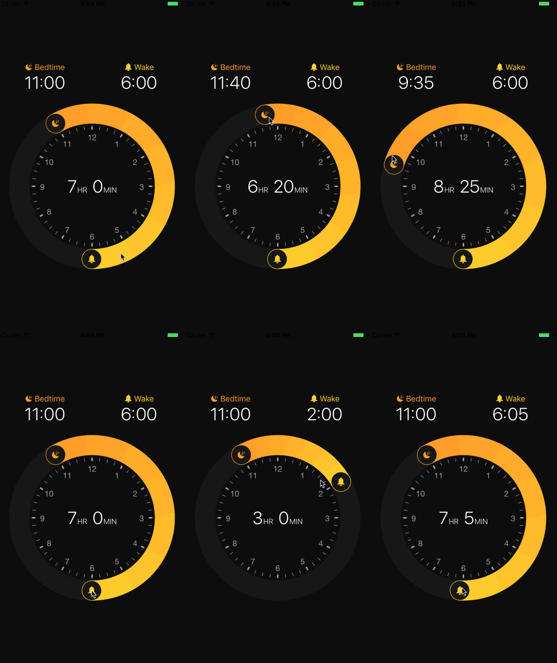
Example app – inspired by Apple's Bedtime :alarm_clock:
(It's just an example what you can achieve – with this package you can create any circular slider)
Installation
-
Install library and react-native-svg
npm i --save react-native-circular-slider react-native-svg -
Link native code for SVG
react-native link react-native-svg
Usage
Import Circular Slider
import CircularSlider from 'react-native-circular-slider';
Use as follows:
<CircularSlider
  startAngle={this.state.startAngle}
  angleLength={this.state.angleLength}
  onUpdate={({ startAngle, angleLength }) => this.setState({ startAngle, angleLength })}
  segments={5}
  strokeWidth={40}
  radius={145}
  gradientColorFrom="#ff9800"
  gradientColorTo="#ffcf00"
  showClockFace
  clockFaceColor="#9d9d9d"
  bgCircleColor="#171717"
  stopIcon={<G><Path .../></G>}
  startIcon={<G><Path .../></G>}
/>
Configuration
You can configure the passing by following props:
- startAngle – angle where the slider starts (from 0 to 2π)
- angleLength - length of the slider (from 0 to 2π)
- onUpdate({ startAngle, angleLength }) - when slider is moved, onUpdate(data) is triggered, where data is an object of new values of startAngle and angleLength.
- segments (optional) - SVG doesn't support canonical gradients, so it's imitated by using multiple linear gradients across the slider. In most cases 5 should be fine.
- strokeWidth (optional) - width of slider
- radius (optional) - size of the slider
- gradientColorFrom (optional) - initial gradient color
- gradientColorTo (optional) - final gradient color
- showClockFace (optional) - if component should render clock face
- bgCircleColor (optional) - color of the circle under the slider (pathway for a slider)
- stopIcon (optional) - SVG Path for a stop icon (see the example)
- startIcon (optional) - SVG Path for a start icon (see the example)
Working example app
With XCode
You'll find working example in the example directory of this repository. You can run it by:
git clone https://github.com/bgryszko/react-native-circular-slider.git
cd  react-native-circular-slider/example/Bedtime
npm install
open ios/Bedtime.xcodeproj
XCode will open. Click Run button and that's it.
With Exponent
The easiest way to run it is with Exponent: https://getexponent.com/@community/bedtime
If you'd rather build it locally, follow these steps:
- Download XDE
- Clone the repo and install dependencies
git clone https://github.com/bgryszko/react-native-circular-slider.git
cd  react-native-circular-slider/example-exponent/Bedtime
npm install
- Open the project with XDE
Author
Bartosz Gryszko ([email protected])
For new components and updates follow me on twitter.
License
MIT