
shadcn-calendar-heatmap
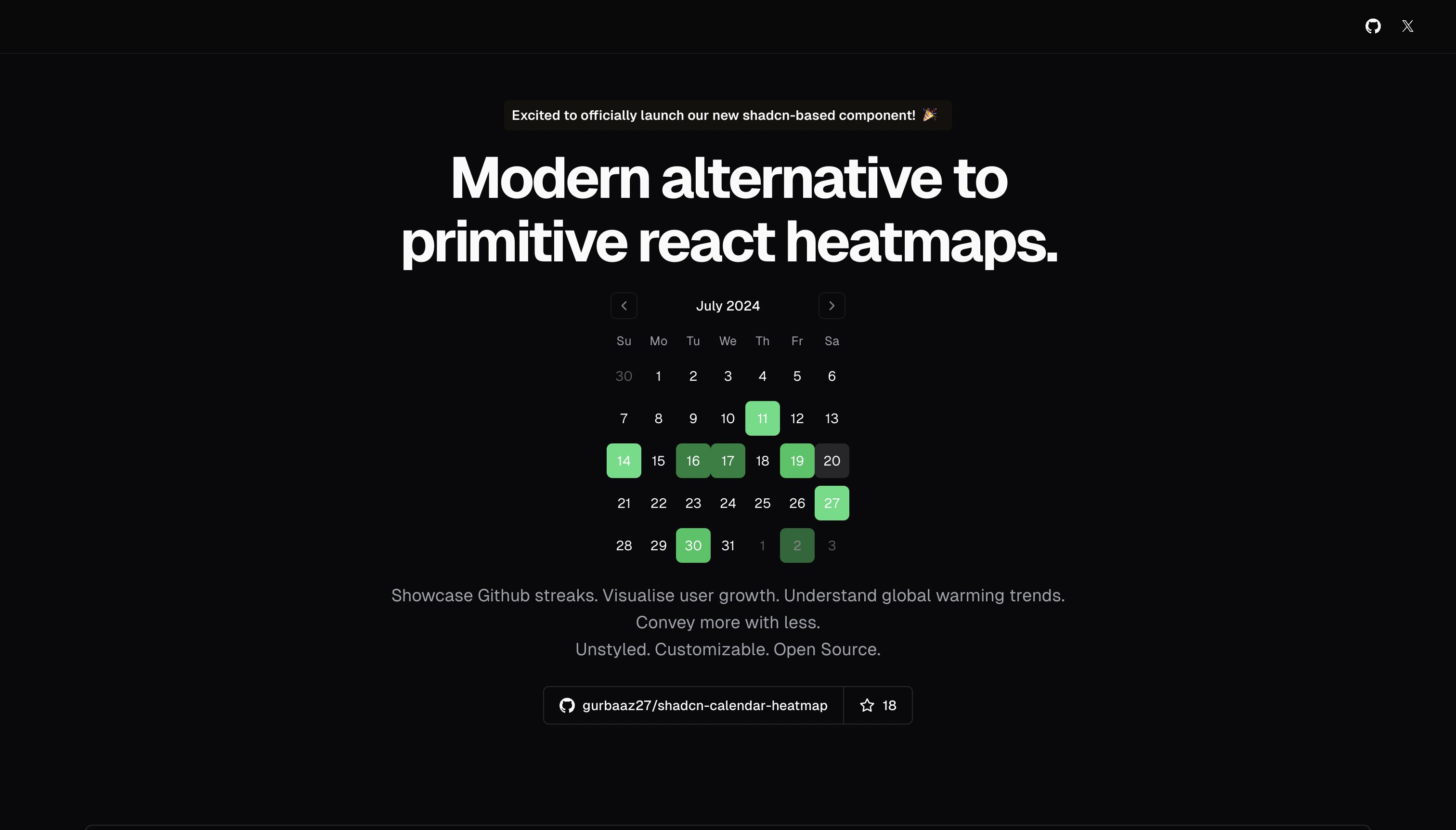
A modern, customizable calendar heatmap component built on top of react-day-picker following shadcn/ui patterns.
Accessible. Unstyled. Customizable. Open Source.
✨ Features
- 🎨 Fully Customizable - Style with Tailwind CSS classes
- 📅 Multiple Data Modes - Use direct date arrays or weighted dates with auto-categorization
- 🔢 Multi-month Support - Display any number of months
- ♿ Accessible - Built on react-day-picker with full keyboard navigation
- 🎯 Type Safe - Written in TypeScript with full type definitions
- 🌈 Preset Variants - GitHub streaks, temperature heatmaps, rainbow colors, and more
🚀 Demo
Check out the live demo at shadcn-calendar-heatmap.vercel.app
📦 Installation
This component follows the shadcn/ui philosophy - copy the component directly into your project.
1. Install Dependencies
npm install react-day-picker date-fns lucide-react
# or
yarn add react-day-picker date-fns lucide-react
# or
pnpm add react-day-picker date-fns lucide-react
2. Copy the Component
Copy components/ui/calendar-heatmap.tsx into your project's components directory.
3. Ensure you have the required utilities
Make sure you have the cn utility function (standard in shadcn/ui projects):
// lib/utils.ts
import { type ClassValue, clsx } from "clsx"
import { twMerge } from "tailwind-merge"

export function cn(...inputs: ClassValue[]) {
  return twMerge(clsx(inputs))
}
📖 Usage
Basic Example - GitHub Contribution Graph
import { CalendarHeatmap } from "@/components/ui/calendar-heatmap"

export default function MyComponent() {
  return (
    <CalendarHeatmap
      variantClassnames={[
        "text-white hover:text-white bg-green-400 hover:bg-green-400",
        "text-white hover:text-white bg-green-500 hover:bg-green-500",
        "text-white hover:text-white bg-green-700 hover:bg-green-700",
      ]}
      datesPerVariant={[
        [new Date('Jan 1, 2024'), new Date('Jan 15, 2024')],
        [new Date('Jun 12, 2024'), new Date('July 1, 2024')],
        [new Date('Jan 19, 2024'), new Date('Apr 14, 2024')],
      ]}
    />
  )
}
Using Weighted Dates
Pass dates with numeric weights, and the component auto-categorizes them:
<CalendarHeatmap
  variantClassnames={[
    "text-white hover:text-white bg-blue-300 hover:bg-blue-300",
    "text-white hover:text-white bg-green-500 hover:bg-green-500",
    "text-white hover:text-white bg-amber-400 hover:bg-amber-400",
    "text-white hover:text-white bg-red-700 hover:bg-red-700",
  ]}
  weightedDates={[
    { date: new Date('Jan 1, 2024'), weight: 2 },
    { date: new Date('Jun 12, 2024'), weight: 8 },
    { date: new Date('Apr 19, 2024'), weight: 13.5 },
  ]}
/>
Multi-month Display
<CalendarHeatmap
  numberOfMonths={3}
  variantClassnames={[...]}
  datesPerVariant={[...]}
/>
🔧 API Reference
Props
| Prop | Type | Required | Description |
|---|---|---|---|
variantClassnames |
string[] |
✅ | Array of Tailwind CSS classes for each intensity level |
datesPerVariant |
Date[][] |
⚡ | 2D array where each inner array contains dates for that variant |
weightedDates |
WeightedDateEntry[] |
⚡ | Array of { date: Date, weight: number } objects |
numberOfMonths |
number |
❌ | Number of months to display (default: 1) |
showOutsideDays |
boolean |
❌ | Show days from adjacent months (default: true) |
⚡ You must provide either
datesPerVariantORweightedDates, not both.
The component also accepts all props from react-day-picker.
Types
type WeightedDateEntry = {
  date: Date
  weight: number
}
🎨 Customization Examples
Temperature Heatmap
const Heatmap = [
  "text-white hover:text-white bg-blue-300 hover:bg-blue-300",   // Cold
  "text-white hover:text-white bg-green-500 hover:bg-green-500", // Mild
  "text-white hover:text-white bg-amber-400 hover:bg-amber-400", // Warm
  "text-white hover:text-white bg-red-700 hover:bg-red-700",     // Hot
]
Rainbow Colors
const Rainbow = [
  "text-white hover:text-white bg-violet-400 hover:bg-violet-400",
  "text-white hover:text-white bg-indigo-400 hover:bg-indigo-400",
  "text-white hover:text-white bg-blue-400 hover:bg-blue-400",
  "text-white hover:text-white bg-green-400 hover:bg-green-400",
  "text-white hover:text-white bg-yellow-400 hover:bg-yellow-400",
  "text-white hover:text-white bg-orange-400 hover:bg-orange-400",
  "text-white hover:text-white bg-red-400 hover:bg-red-400",
]
⭐ Star History
🤝 Contributing
Contributions are welcome! Feel free to open an issue or submit a pull request.
📄 License
MIT © Gurbaaz Singh Nandra