

Todo Swipe Card

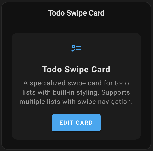
A specialized swipe card for todo lists in Home Assistant with custom styling.
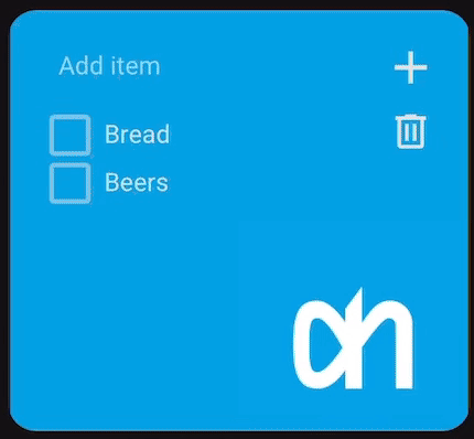
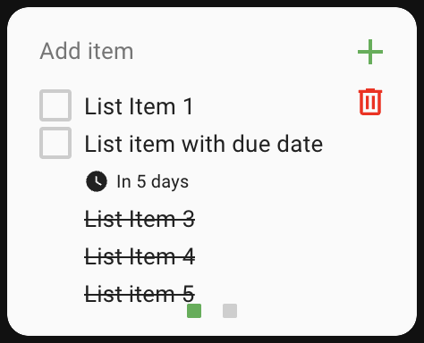
Todo Swipe Card is a customizable container card for Home Assistant specifically designed for to-do lists. It allows you to place multiple to-do lists in a single space and navigate between them with intuitive swipe gestures. The card features built-in styling for a clean, modern look and optimizes dashboard space by grouping related to-do lists together. With mobile-friendly touch and mouse navigation, pagination indicators, adjustable card spacing, and customizable background images, Todo Swipe Card enhances both functionality and user experience with minimal configuration.
Features
- Swipe between multiple to-do lists
- Built-in styling with customizable background images
- Pagination dots
- Configurable card spacing
- Options to show/hide completed items
- Delete completed items button with optional confirmation dialog
- Drag-and-drop reordering (for supported integrations)
- Visual editor support
Requirements
- Home Assistant 2023.4 or later
Installation
HACS (Recommended)
- Open HACS
- Search for "Todo Swipe Card" and install it
Or click this button to open the repository page in HACS:

HACS (Manual)
- Open HACS
- Go to "Frontend" section
- Click on the three dots in the top right corner
- Select "Custom repositories"
- Add this repository URL:
https://github.com/nutteloost/todo-swipe-card - Click "Add"
- Search for "Todo Swipe Card" and install it
Manual Installation
- Download
todo-swipe-card.jsfrom the latest release - Copy it to
config/www/todo-swipe-card/todo-swipe-card.js - Add the following to your configuration.yaml:
lovelace: resources: - url: /local/todo-swipe-card/todo-swipe-card.js type: module - Restart Home Assistant
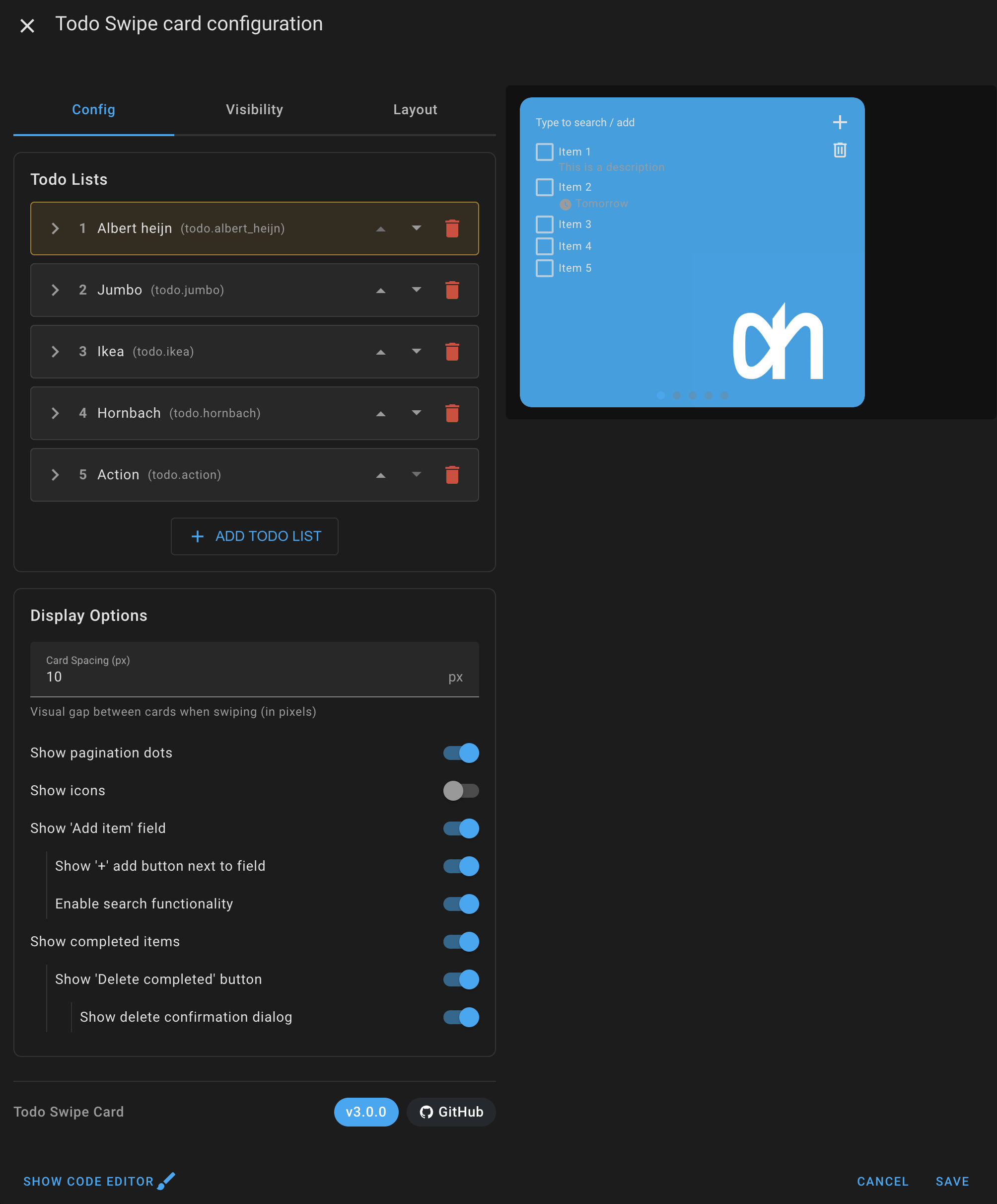
Visual Editor
The Todo Swipe Card includes a visual editor that appears when you add or edit the card through the Home Assistant UI. Features include:
- Add/remove to-do lists
- Visual toggle for pagination dots
- Simple number input for card spacing
- Background image configuration for each to-do list
- Display order setting of todo list items per list
- Display options for completed items, add buttons, and more
- Real-time preview of changes
Search for 'Todo Swipe Card'
Edit the card
Configuration
This card can be configured using the visual editor or YAML.
Options
| Name | Type | Default | Description |
|---|---|---|---|
entities |
list | Required | List of todo entities to display |
show_pagination |
boolean | true |
Show/hide pagination dots |
show_icons |
boolean | false |
Show/hide icons for each todo list |
show_addbutton |
boolean | false |
Show/hide the "+" button next to the add field |
show_create |
boolean | true |
Show/hide the add item input field |
show_completed |
boolean | false |
Show/hide completed items |
show_completed_menu |
boolean | false |
Show/hide delete completed items button |
enable_search |
boolean | false |
Enable or disable search functionality |
clear_search_on_uncheck |
boolean | false |
Clear search filter when unchecking a completed item |
delete_confirmation |
boolean | false |
Show confirmation dialog when deleting completed items |
card_spacing |
number | 15 |
Space between cards in pixels |
font_size |
number | 11 |
Font size of the todo item text in pixels (also affects the add-item field, descriptions and due dates) |
title_font_size |
number | 16 |
Font size of a list's title text in pixels (when show_title is enabled) |
Entity Configuration Options
| Name | Type | Default | Description |
|---|---|---|---|
entity |
string | Required | Todo list entity ID |
show_title |
boolean | false |
Show custom title above todo list |
title |
string | Optional | Custom title text (Only used if show_title is true) |
background_image |
string | Optional | Background image URL for this entity |
display_order |
string | none | Sort order: none, alpha_asc, alpha_desc, duedate_asc, duedate_desc |
icon |
string | Optional | Custom icon for this todo list (e.g., mdi:cart-variant) |
hide_future_items |
boolean | false |
Only show items due today or earlier; items with a future due date are hidden. Completed items and items without a due date are unaffected. |
max_items |
number | Optional | Limit how many incomplete items are shown (completed items are not counted toward the limit). Handy for keeping recurring lists short. |
Example Configuration
Simple configuration
type: custom:todo-swipe-card
entities:
  - todo.shopping_list
  - todo.home_tasks
  - todo.work_projects
show_pagination: true
show_completed: true
card_spacing: 15
Advanced Configuration
type: custom:todo-swipe-card
entities:
- entity: todo.shopping_list
background_image: /local/images/shopping_bg.jpg
show_title: true
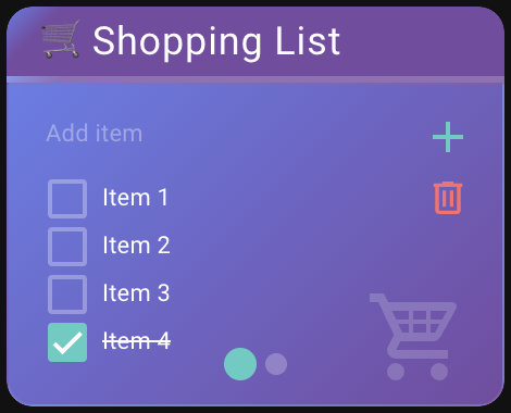
title: "Shopping List"
display_order: alpha_asc
icon: mdi:cart-variant
- entity: todo.home_tasks
background_image: /local/images/home_bg.jpg
show_title: true
title: "Home Tasks"
display_order: duedate_asc
icon: mdi:home-variant
hide_future_items: true
max_items: 5
- entity: todo.work_projects
display_order: none
icon: mdi:briefcase-variant
show_pagination: true
show_icons: true
show_addbutton: true
show_create: true
show_completed: true
show_completed_menu: true
enable_search: true
clear_search_on_uncheck: true
delete_confirmation: true
card_spacing: 10Drag-and-Drop Reordering
The Todo Swipe Card supports drag-and-drop reordering of todo items for integrations that implement the MOVE_TODO_ITEM feature.
How to Use
- Simply click and hold on any todo item
- Drag it up or down to your desired position
- Visual indicators will show where the item will be placed
- Release to complete the move
Note: The Shopping List integration and some third-party integrations may not support drag-and-drop reordering. In these cases, items will display without drag-and-drop functionality.
Customizing and Theming
The Todo Swipe Card provides extensive customization capabilities through several methods: Home Assistant themes, card-mod styling, and UIX styling. The card supports over fourty CSS variables that control every aspect of its appearance, from basic colors and typography to sophisticated pagination styling and transition effects.
Simplified Customization Approach: Todo Swipe Card includes CSS variables that make customization much easier compared to traditional card-mod styling. Instead of having to figure out complex CSS selectors or inspect the card's internal structure, you can simply use these predefined variables to customize colors, sizes, and other visual elements. This means you can create great-looking themes without needing to be a CSS expert or spending time hunting down the right selectors to target specific elements.
When combining theme-based styling with card-mod overrides, remember that card-mod styles take precedence over theme variables. This hierarchy allows you to establish baseline styling through themes while maintaining the flexibility to customize individual card instances as needed.
Method 1: Home Assistant Themes
Create or modify a theme in your Home Assistant configuration to apply styling across all instances of the Todo Swipe Card. This method is ideal for consistent styling throughout your dashboard.
Add the following to your configuration.yaml:
frontend:
  themes:
    todo_custom_theme:
      # Your existing theme variables
      primary-color: "#3498db"
      # Todo Swipe Card specific variables
      todo-swipe-card-text-color: "#2c3e50"
      todo-swipe-card-pagination-dot-active-color: "#e74c3c"
      # Add any other variables from the complete CSS reference
Method 2: Card-Mod Styling
Apply styling directly to individual card instances using card-mod. This method provides maximum flexibility and allows for unique styling of specific cards.
type: custom:todo-swipe-card
entities:
  - todo.shopping_list
card_mod:
  style: |
    :host {
      --todo-swipe-card-text-color: #ffffff;
      --todo-swipe-card-background: linear-gradient(45deg, #667eea, #764ba2);
    }
Method 3: UIX Styling
If you use UIX instead of card-mod, the card now applies UIX styling natively. Add a uix: block to the card to style the whole swipe card, and/or a uix: block to an individual list to style just that list. The styling is re-applied on every rebuild, so it survives swipes and config edits. This is a complete no-op when UIX is not installed, so it is safe to leave in your config either way.
type: custom:todo-swipe-card
uix:
  style: |
    :host {
      --todo-swipe-card-text-color: #ffffff;
      --todo-swipe-card-background: linear-gradient(45deg, #667eea, #764ba2);
    }
entities:
  - entity: todo.shopping_list
    # Per-list UIX (styles only this list)
    uix:
      style: |
        :host {
          --todo-swipe-card-text-color: #ffeb3b;
        }
Complete CSS Variables Reference
Core Appearance
--todo-swipe-card-background:                           /* Main card background color or gradient */
--todo-swipe-card-backdrop-filter:                      /* Backdrop filter effect for the card (e.g., blur(10px)) */
--todo-swipe-card-text-color:                           /* Primary text color for all todo items, excluding descriptions and due dates */
Typography and Layout
--todo-swipe-card-font-size:                            /* Base font size for todo items (default: 11px) */
--todo-swipe-card-item-font-weight:                     /* Font weight for the main text of a todo item (e.g., normal, bold, 500) */
--todo-swipe-card-item-height:                          /* Minimum height of individual todo items (default: calc(var(--todo-swipe-card-font-size, 11px) + 8px)) */
--todo-swipe-card-item-margin:                          /* Spacing between checkbox and todo item text (default: 5px) */
--todo-swipe-card-item-align:                           /* Vertical alignment of todo items: flex-start, center, flex-end (default: flex-start) */
--todo-swipe-card-line-height:                          /* Line height for main todo text when it wraps to multiple lines (default: 1.3) */
--todo-swipe-card-item-spacing:                         /* Consistent margin between todo items (default: 1px) */
--todo-swipe-card-summary-margin-top:                   /* Space above the main todo item text (default: 3px) */
--todo-swipe-card-checkbox-margin-top:                  /* Top margin for checkboxes for fine positioning (default: 1px) */
Due Date Styling
--todo-swipe-card-font-size-due-date:                   /* Font size for due dates and associated icon (default: 11px) */
--todo-swipe-card-font-weight-due-date:                 /* Font weight for the due date text */
--todo-swipe-card-font-color-due-date:                  /* Color of the due dates and associated icon */
--todo-swipe-card-font-color-due-date-overdue:          /* Color of overdue due dates text and associated icon */
--todo-swipe-card-due-date-margin-top:                  /* Space above due date (default: 2px) */
--todo-swipe-card-due-icon-size:                        /* Size of the clock icon next to due dates (default: 14px) */
Description Styling
--todo-swipe-card-font-size-description:                /* Font size of the description text of todo items */
--todo-swipe-card-font-weight-description:              /* Font weight for the description text of a todo item */
--todo-swipe-card-font-color-description:               /* Color of the description text of todo items */
--todo-swipe-card-description-margin-top:               /* Space above description text (default: 1px) */
Title Configuration
--todo-swipe-card-title-height:                         /* Height of entity titles (default: 40px) */
--todo-swipe-card-title-background:                     /* Background color of entity titles */
--todo-swipe-card-title-backdrop-filter:                /* Backdrop filter for title bar (falls back to --todo-swipe-card-backdrop-filter) */
--todo-swipe-card-title-color:                          /* Text color of entity titles */
--todo-swipe-card-title-font-size:                      /* Font size of entity titles (default: 16px) */
--todo-swipe-card-title-font-weight:                    /* Font weight of entity titles (default: 500) */
--todo-swipe-card-title-border-color:                   /* Border color below entity titles */
--todo-swipe-card-title-border-width:                   /* Border width below entity titles (default: 1px) */
--todo-swipe-card-title-padding-horizontal:             /* Horizontal padding of entity titles (default: 16px) */
--todo-swipe-card-title-align:                          /* Title alignment: left, center, right (default: center) */
Icon Styling
--todo-swipe-card-icon-size:                            /* Size of todo list icons (default: 48px) */
--todo-swipe-card-icon-color:                           /* Color of todo list icons with opacity support */
--todo-swipe-card-icon-opacity:                         /* Opacity of todo list icons (default: 0.6) */
--todo-swipe-card-icon-right:                           /* Distance of icon from right edge (default: 16px) */
--todo-swipe-card-icon-bottom:                          /* Distance of icon from bottom edge (default: 8px) */
Checkbox Styling
--todo-swipe-card-checkbox-color:                       /* Color of unchecked checkboxes, use rgba values to also control opacity (rgba(255, 0, 0, 0.6);) */
--todo-swipe-card-checkbox-checked-color:               /* Color of checked checkboxes (default: var(--primary-color)) */
--todo-swipe-card-checkbox-checkmark-color:             /* Color of the checkmark inside checked boxes */
--todo-swipe-card-checkbox-size:                        /* Size of checkbox elements (default: 18px) */
Input Field Styling
--todo-swipe-card-input-font-weight:                    /* Font weight for the text typed into the 'Add item' field */
--todo-swipe-card-placeholder-font-weight:              /* Font weight for the placeholder text in the 'Add item' field */
--todo-swipe-card-placeholder-color:                    /* Color of 'Add item' text in input fields */
--todo-swipe-card-placeholder-opacity:                  /* Opacity of 'Add item' text (default: 1) */
Search Counter Styling
--todo-swipe-card-search-counter-font-size:             /* Font size for search results counter (default: 12px) */
--todo-swipe-card-search-counter-color:                 /* Color of search results counter text */
Pagination Customization
--todo-swipe-card-pagination-dot-size:                  /* Diameter of pagination dots (default: 8px) */
--todo-swipe-card-pagination-dot-active-color:          /* Color of the currently active pagination dot */
--todo-swipe-card-pagination-dot-inactive-color:        /* Color of inactive pagination dots */
--todo-swipe-card-pagination-dot-spacing:               /* Horizontal space between pagination dots (default: 4px) */
--todo-swipe-card-pagination-dot-border-radius:         /* Border radius of pagination dots (default: 50%) */
--todo-swipe-card-pagination-dot-active-size-multiplier: /* Size multiplier for active dots (default: 1) */
--todo-swipe-card-pagination-bottom:                    /* Distance of pagination from bottom edge (default: 8px) */
--todo-swipe-card-pagination-background:                /* Background color of the pagination area */
--todo-swipe-card-pagination-dot-active-opacity:        /* Opacity of active pagination dot (default: 1) */
--todo-swipe-card-pagination-dot-inactive-opacity:      /* Opacity of inactive pagination dot (default: 0.6) */
Animation and Transitions
--todo-swipe-card-transition-speed:                     /* Duration of swipe animations (default: 0.3s) */
--todo-swipe-card-transition-easing:                    /* Easing function for transitions (default: ease-out) */
Interactive Elements
--todo-swipe-card-delete-button-top:                    /* Manual positioning of delete button from top */
--todo-swipe-card-delete-button-color:                  /* Color of the delete completed items button */
--todo-swipe-card-add-button-color:                     /* Color of the add item button */
Styling Examples
Example 1
Example 1 (Advanced) Configuration:
type: custom:todo-swipe-card
entities:
  - entity: todo.shipping_list
    show_title: true
    title: 🛒 Shopping List
    display_order: alpha_asc
    icon: mdi:cart-variant
  - entity: todo.work_projects
    show_title: true
    title: 💼 Work Projects
    display_order: duedate_desc
    icon: mdi:hammer-screwdriver
card_spacing: 10
show_pagination: true
show_icons: true
show_create: true
show_addbutton: true
show_completed: true
show_completed_menu: true
enable_search: true
delete_confirmation: true
card_mod:
  style: |
    :host {
      --todo-swipe-card-background: linear-gradient(135deg, #667eea 0%, #764ba2 100%);
      --todo-swipe-card-text-color: #ffffff;
      --todo-swipe-card-item-spacing: 8px;

      /* Typography */
      --todo-swipe-card-font-size: 11px;
      --todo-swipe-card-font-size-due-date: 10px;

      /* Title styling - left aligned */
      --todo-swipe-card-title-height: 35px;
      --todo-swipe-card-title-background: linear-gradient(135deg, #667eea 0%, #764ba2 10%);
      --todo-swipe-card-title-color: #ffffff;
      --todo-swipe-card-title-font-size: 18px;
      --todo-swipe-card-title-font-weight: 400;
      --todo-swipe-card-title-align: flex-start;
      --todo-swipe-card-title-border-color: rgba(255, 255, 255, 0.2);
      --todo-swipe-card-title-border-width: 3px;

      /* Due date styling */
      --todo-swipe-card-font-color-due-date: rgba(255, 255, 255, 0.8);
      --todo-swipe-card-font-color-due-date-overdue: #ff6b6b;
      --todo-swipe-card-font-color-description: rgba(255, 255, 255, 0.7);

      /* Tighter line spacing */
      --todo-swipe-card-line-height: 1.2;
      --todo-swipe-card-description-margin-top: 2px;
      --todo-swipe-card-due-date-margin-top: 1px;

      /* Modern checkbox styling */
      --todo-swipe-card-checkbox-color: rgba(255, 255, 255, 0.3);
      --todo-swipe-card-checkbox-checked-color: #4ecdc4;
      --todo-swipe-card-checkbox-checkmark-color: #ffffff;
      --todo-swipe-card-checkbox-size: 22px;

      /* Input field styling */
      --todo-swipe-card-placeholder-color: rgba(255, 255, 255, 0.7);
      --todo-swipe-card-placeholder-opacity: 0.5;

      /* Interactive elements */
      --todo-swipe-card-add-button-color: #4ecdc4;
      --todo-swipe-card-delete-button-color: #ff6b6b;

      /* Pagination Dots */
      --todo-swipe-card-pagination-dot-size: 10px;
      --todo-swipe-card-pagination-dot-active-color: #4ecdc4;
      --todo-swipe-card-pagination-dot-inactive-color: rgba(255, 255, 255, 0.4);
      --todo-swipe-card-pagination-dot-spacing: 2px;
      --todo-swipe-card-pagination-bottom: 12px;
      --todo-swipe-card-pagination-dot-active-size-multiplier: 1.5;
    }
Example 2
Example 2 Configuration
card_mod:
  style: |
    :host {
      --todo-swipe-card-background: #fafafa;
      --todo-swipe-card-text-color: #212121;
      --todo-swipe-card-font-size: 13px;
      --todo-swipe-card-font-size-due-date: 10px;
      --todo-swipe-card-item-margin: 6px;

      --todo-swipe-card-checkbox-color: rgba(97, 97, 97, 0.3);
      --todo-swipe-card-checkbox-checked-color: transparent;
      --todo-swipe-card-checkbox-checkmark-color: transparent;

      --todo-swipe-card-field-line-color: #e0e0e0;
      --todo-swipe-card-placeholder-color: #757575;
      --todo-swipe-card-add-button-color: #4caf50;
      --todo-swipe-card-delete-button-color: red;

      --todo-swipe-card-pagination-dot-size: 8px;
      --todo-swipe-card-pagination-dot-border-radius: 1px;
      --todo-swipe-card-pagination-dot-active-color: #4caf50;
      --todo-swipe-card-pagination-dot-spacing: 6px;
      --todo-swipe-card-pagination-bottom: 10px;

      --todo-swipe-card-transition-speed: 0.25s;
      --todo-swipe-card-transition-easing: ease-out;
    }
Example 3
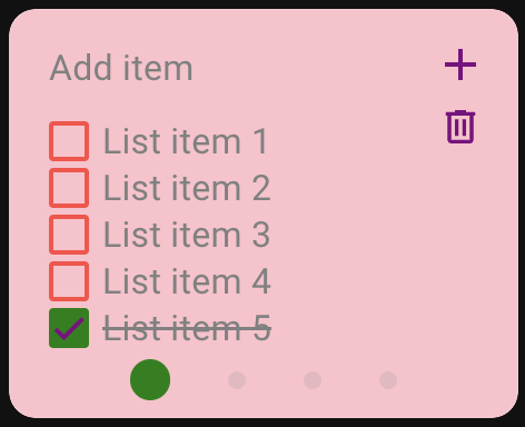
Example 3 Configuration
card_mod:
  style: |
    :host {
      --todo-swipe-card-background: pink;
      --todo-swipe-card-text-color: grey;
      --todo-swipe-card-font-size: 16px;

      --todo-swipe-card-checkbox-color: rgba(255, 0, 0, 0.75);
      --todo-swipe-card-checkbox-checked-color: green;
      --todo-swipe-card-checkbox-checkmark-color: purple;

      --todo-swipe-card-pagination-dot-spacing: 13px;
      --todo-swipe-card-pagination-dot-active-color: green;

      --todo-swipe-card-add-button-color: purple;
      --todo-swipe-card-delete-button-color: purple;
    }
Example 4 - Advanced Per-Card Title Styling
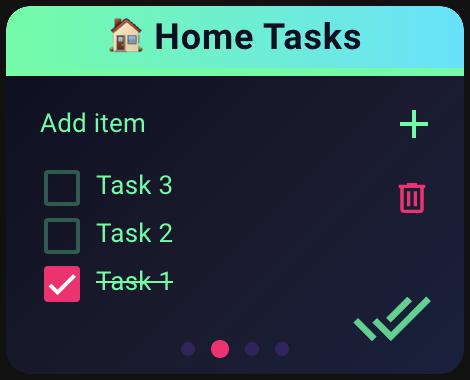
Example 4 (Advanced Per-Card Title Styling):
For even more customization, you can apply different title styles to individual cards using CSS selectors. This allows each todo list to have its own unique title appearance while maintaining consistent base styling.
The following example shows how to style titles differently for each card using the .slide:nth-child() selector:
card_mod:
  style: |
    :host {
      /* Dark background with neon accents */
      --todo-swipe-card-background: linear-gradient(135deg, #0f0f23 0%, #1a1a2e 50%, #16213e 100%);
      --todo-swipe-card-text-color: #00ff9f;

      /* Title styles */
      --todo-swipe-card-title-height: 35px;
      --todo-swipe-card-title-font-size: 18px;
      --todo-swipe-card-title-font-weight: 700;
      --todo-swipe-card-title-border-width: 4px;
      --todo-swipe-card-delete-button-top: 78px;

      /* Neon checkboxes */
      --todo-swipe-card-checkbox-color: rgba(0, 255, 159, 0.3);
      --todo-swipe-card-checkbox-checked-color: #ff006e;
      --todo-swipe-card-checkbox-checkmark-color: #ffffff;
      --todo-swipe-card-checkbox-size: 24px;

      /* Typography */
      --todo-swipe-card-font-size: 13px;
      --todo-swipe-card-font-color-due-date: #8338ec;
      --todo-swipe-card-font-color-due-date-overdue: #ff006e;
      --todo-swipe-card-font-color-description: rgba(0, 255, 159, 0.7);

      /* Glowing icons */
      --todo-swipe-card-icon-color: #00ff9f;
      --todo-swipe-card-icon-size: 40px;
      --todo-swipe-card-icon-opacity: 0.8;

      /* Neon pagination */
      --todo-swipe-card-pagination-dot-active-color: #ff006e;
      --todo-swipe-card-pagination-dot-inactive-color: rgba(131, 56, 236, 0.4);
      --todo-swipe-card-pagination-dot-size: 8px;
      --todo-swipe-card-pagination-dot-active-size-multiplier: 1.3;

      /* Interactive elements */
      --todo-swipe-card-add-button-color: #00ff9f;
      --todo-swipe-card-delete-button-color: #ff006e;
    }

    ha-card {
      border-style: hidden;
    }

    /* First card - Electric Pink */
    .slide:nth-child(1) .todo-swipe-card-external-title {
      background: linear-gradient(90deg, #ff006e 0%, #ff0080 100%) !important;
      color: #ffffff !important;
      border-bottom-color: #ff006e !important;
    }

    /* Second card - Neon Green */
    .slide:nth-child(2) .todo-swipe-card-external-title {
      background: linear-gradient(90deg, #00ff9f 0%, #00e5ff 100%) !important;
      color: #0f0f23 !important;
      border-bottom-color: #00ff9f !important;
    }

    /* Third card - Electric Blue */
    .slide:nth-child(3) .todo-swipe-card-external-title {
      background: linear-gradient(90deg, #3a86ff 0%, #8338ec 100%) !important;
      color: #ffffff !important;
      border-bottom-color: #3a86ff !important;
    }

    /* Fourth card - Cyber Purple */
    .slide:nth-child(4) .todo-swipe-card-external-title {
      background: linear-gradient(90deg, #8338ec 0%, #ff006e 100%) !important;
      color: #ffffff !important;
      border-bottom-color: #8338ec !important;
    }
How it works:
The :nth-child() selector targets specific slides based on their position (1st, 2nd, 3rd, etc.)
Each card can have completely different title styling while sharing the same base configuration.
Don't forget to adjust --todo-swipe-card-delete-button-top if you change the title height to ensure proper button positioning (like I did in this example)
This technique works with any CSS property - background colors, gradients, borders, shadows, and more!
My Other Custom Cards
Check out my other custom cards for Home Assistant:
- Simple Swipe Card - A swipeable container card that allows you to add multiple cards and swipe between them
- Actions Card - Wraps another Home Assistant card to add tap, hold, and double-tap actions
Enjoying my cards? Consider donating a beer (or two)! It will keep me going.