

a11y-color-tokens
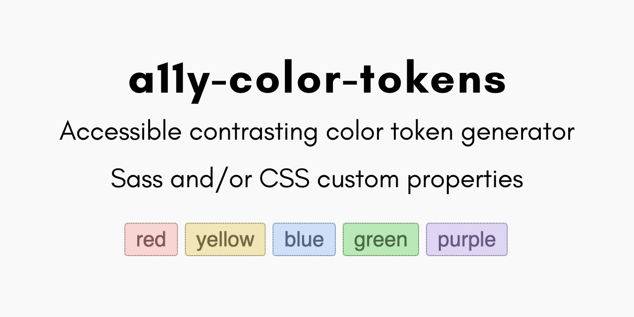 # a11y-color-tokens > Generate accessible complementary text or UI colors as Sass variables and/or CSS custom properties from your base color tokens. ## Why do I need this? While many tools are available to _check_ contrast, but efficiently picking an accessible palette can be time-consuming and frustrating. As someone with way too many side projects, I'll say that color contrast is always something that slows down my workflow. In fact, I built this precisely to speed up my own process! Additionally, everyone benefits from documentation about color token contrast to ensure tokens are _used_ accessibly. `a11y-color-tokens` lets you focus on just selecting the base colors while taking care of generating contrast-safe complementary tones to ensure you meet [this important success criterion](https://www.w3.org/WAI/WCAG22/Understanding/contrast-minimum.html). A unique feature of this project is that it scales the original color value for a more pleasing visual contrast vs only returning either white or black. (_Don't worry - you're able to override the contrast color if needed!_) > 💡 "Tokens" comes from the design system world terminology of "design tokens" which you can [learn more about from the original creator, Jina Anne](https://www.smashingmagazine.com/2019/11/smashing-podcast-episode-3/). ## What's in the box **Example output**: ```scss // `primary` name and value provided in your tokens $color-primary: rebeccapurple !default; // `on-primary` name and value generated by a11y-color-tokens // and guaranteed to have at least 4.5 contrast with `primary` $color-on-primary: #ceb3e9 !default; // Also includes a list based on your provided color names $base-color-tokens: ("primary", "secondary"); ``` The default options generate individual Sass variables, as well as a map of those variables and a mixin that contains the palette as CSS custom properties, ready for you to drop into `:root` or another location of your choice. Sass variables and the map include the `!default` flag as an additional way to extend, scale, and share your tokens. **[View the sample default output >](https://github.com/5t3ph/a11y-color-tokens/blob/main/sass/_color-tokens.scss)** Alternatively, pass `"css"` as the `tokenOutputFormat` to only output CSS custom properties within the `:root` selector. Additionally, [an optional Markdown document](https://github.com/5t3ph/a11y-color-tokens/blob/main/sass/_color-token-contrast.md) is generated with contrast cross-compatibility between all available color tokens. > Review an example of [using the generated Sass assets >](https://github.com/5t3ph/a11y-color-tokens/blob/main/sass/style.scss) ## Usage Install `a11y-color-tokens` into any project using: ```bash npm install a11y-color-tokens --save-dev ``` You can then add it to your scripts or call it directly from the command line, but first, you must prepare a color tokens file. ### Create Color Tokens File **Before the script will work**, you will need to prepare your color tokens as a module that exports the tokens array. The expected format is as follows: ```js // Example color-tokens.js module.exports = [ { /* * `name` - Required * Any string, will be used for color reference */ name: "primary", /* * `color` - Required * Any valid CSS color value */ color: "rgb(56, 84, 230)", /* * `onColor` - Optional * enum: undefined | "[css color value]" | false * * If undefined, will be generated as relative tone of `color` * that meets contrast according to `ratioKey` * * If a color value provided, will still be checked for contrast * and a warning comment added if it doesn't pass * * Set to `false` to omit generation */ /* * `ratioKey` - Optional * enum: undefined | "small" (default) | "large" * * Corresponds to mimimum contrast for either normal text ("small" = 4.5) * or large text/user interface components ("large" = 3) */ }, ]; ``` View [color-tokens.js](https://github.com/5t3ph/a11y-color-tokens/blob/main/color-tokens.js) in the package repo for more full example. ### Recommended Setup Add as a standalone script, and then call prior to your build and start commands to ensure tokens are always fresh. > At minimum, be sure to pass an existing `outputDirPath` (default: `"sass"`) and point `colorTokensPath` (default: `"color-tokens.js"`) to your tokens file. ```json "scripts": { "color-tokens": "a11y-color-tokens --outputDirPath='src/sass' --colorTokensPath='_theme/color-tokens.js'", "start": "npm-run-all color-tokens [your other scripts]", "build": "npm-run-all color-tokens [your other scripts]" }, ``` _**Sass processing is not included**, you must add that separately. This package is a great companion to my [11ty-sass-skeleton template](https://github.com/5t3ph/11ty-sass-skeleton) which is a barebones Eleventy static site_. ## Config Options | Option | Type | Default | | ----------------------- | ----------------------- | ---------------------- | | outputDirPath | string | "sass" | | outputFilename | string | "\_color-tokens.scss" | | colorTokensPath | string | "color-tokens.js" | | tokenOutputFormat | enum: "sass" \| "css" | "sass" | | sassOutputName | string | "color-tokens" | | tokenPrefix | enum: string \| boolean | "color-" | | compatibilityDocs | boolean | true | | compatibilityDocsPath | string | {outputDirPath} | | compatibilityDocsTitle | string | "Color Token Contrast" | | includeCustomProperties | boolean | true | | customPropertiesFormat | enum: "mixin" \| "root" | "mixin" | > To set a boolean option to `false`, format the option as `--no-[optionName]` ## Config Examples ### Vanilla CSS output of custom properties As noted in the intro, the default output is Sass based. Flip this to output all generated tokens as CSS custom properties within `:root` with the following: ```bash a11y-color-tokens --tokenOutputFormat='css' --outputFilename='theme-colors.css' ``` > For the CSS-only output, you will need to update `outputFilename` since the default creates this output as a Sass (`.scss`) file. ### Direct `:root` Sass output of custom properties The default creates a `mixin` containing the CSS custom properties version of the tokens. If you'd rather output them in `:root` directly, set the following: ```bash a11y-color-tokens --customPropertiesFormat='root' ``` ### Update Sass map and mixin name This is handled by updating the following: ```bash a11y-color-tokens --sassOutputName='colors' ``` ### Update or remove the generated token prefix Change the prefix of `color-` by setting a new value, or use `--no-tokenPrefix` to remove token prefixing. ```bash a11y-color-tokens --tokenPrefix='theme-' ``` ### Prevent CSS custom properties output This is handled with `includeCustomProperties` and can be removed with: ```bash a11y-color-tokens --no-includeCustomProperties ``` ### Remove the `_color-token-contrast.md` documentation This is handled with `compatibilityDocs` and can be removed with: ```bash a11y-color-tokens --no-compatibilityDocs ``` ### Change output location of `_color-token-contrast.md` The default places the docs in the same directory defined for `outputDirPath`. To change, supply a new file path (the `_` prefix will be removed from the Markdown filename as well): ```bash a11y-color-tokens --compatibilityDocsPath='docs' ``` ## Colophon and Credits Hi! I'm [Stephanie Eckles - @5t3ph](https://twitter.com/5t3ph) and I've been a front-end focused developer for over a decade. [Check out more of my projects](https://thinkdobecreate.com) including in-depth tutorials to help you upgrade your CSS skills on [ModernCSS.dev](https://moderncss.dev), and my [egghead video lessons](https://5t3ph.dev/egghead) on all kinds of front-end topics. `a11y-color-tokens` relies on the following packages: - [color](https://www.npmjs.com/package/color) - for contrast checking and color model evaluation - [a11ycolor](https://www.npmjs.com/package/a11ycolor) - for finding the nearest contrast-safe match > If you've found this project useful, I'd appreciate ☕️ [a coffee to keep me coding](https://www.buymeacoffee.com/moderncss)!