

A modern Flutter UI package with beautiful, customizable components designed for clean and consistent user interfaces.




Latest Release: 1.2.1
Dart 3+ Compatibility & Input Focus
- Added
focusNodesupport toHuxInputfor integrations such asRawAutocomplete - Replaced
lucide_iconswithlucide_icons_flutter - Fixed Flutter web builds on newer Dart SDKs where
IconDatais final - Removed the example app's stale direct
lucide_iconsdependency


🎮 Live Demo
Try all components in your browser! Explore the full Hux UI component library with our interactive demo:

👉 ui.thehuxdesign.com - Test buttons, inputs, dialogs, charts, and more in real-time with dark mode support.
Installation
flutter pub add hux
Features
- Modern Design - Clean, minimal design language
- Dark Mode Support - Built-in light and dark theme support
- Data Visualization - Animated charts for data presentation
- Responsive - Components adapt to different screen sizes
- Customizable - Extensive customization options
- Easy to Use - Simple, intuitive API
Components
Buttons
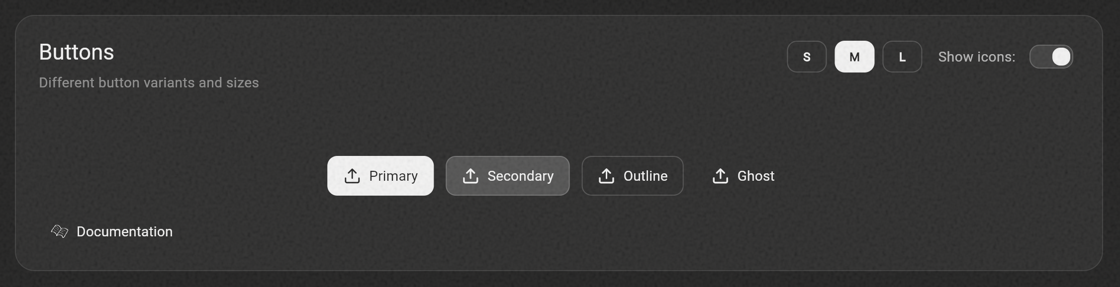
HuxButton- Customizable button with multiple variants (primary, secondary, outline, ghost)
Cards
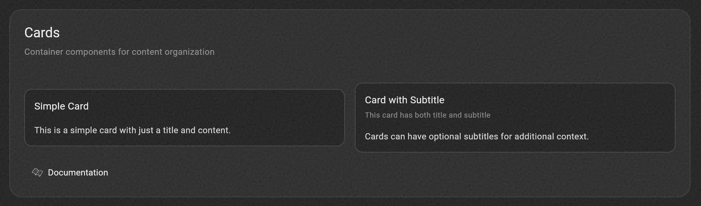
HuxCard- Flexible card component with optional header, title, and actions
Tabs
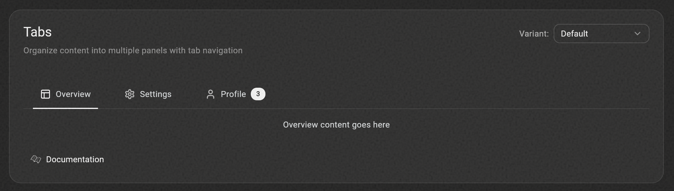
HuxTabs- Organize content into multiple panels with tab navigationHuxTabBar- Chrome-style tab bar with drag-to-reorder and dynamic tab managementHuxTabView- Full tab workspace with drag-to-reorder, close buttons, and multiple visual variants
Inputs
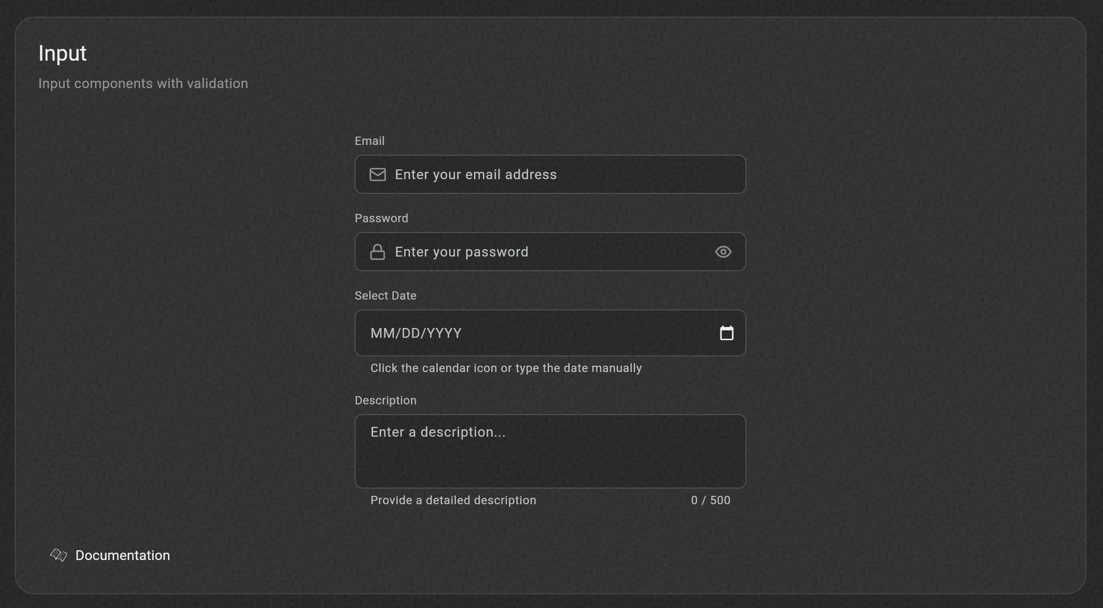
HuxInput- Enhanced text input with consistent styling (renamed from HuxTextField)HuxTextarea- Multi-line text input optimized for longer content with character count supportHuxDateInput- Date input with automatic formatting and integrated calendar pickerHuxOtpInput- One-Time Password input with automatic focus management and paste support
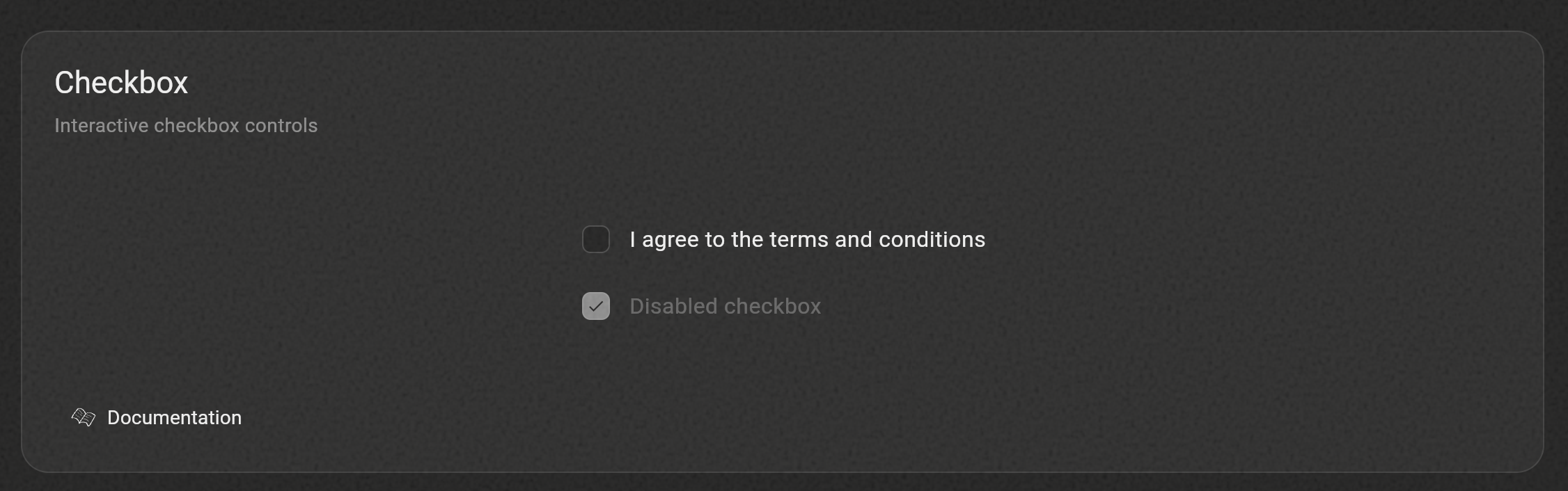
HuxCheckbox- Interactive checkbox with custom styling and labels
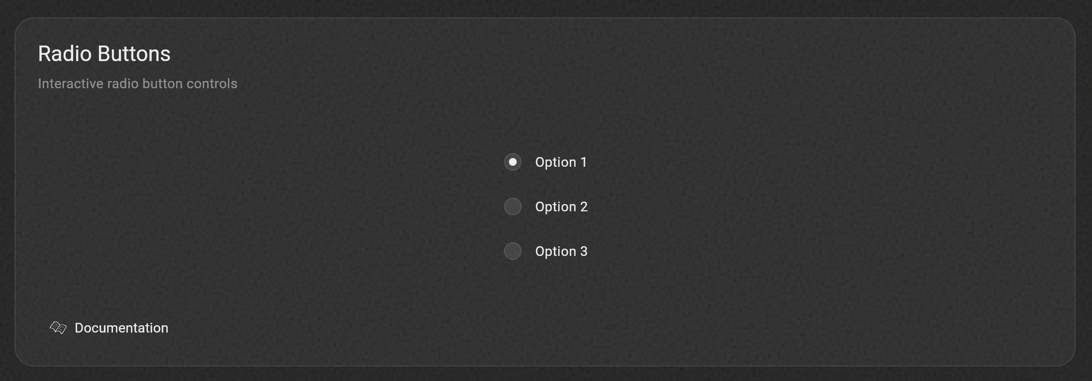
HuxRadio- Radio button controls for single selection from groups
Dialogs
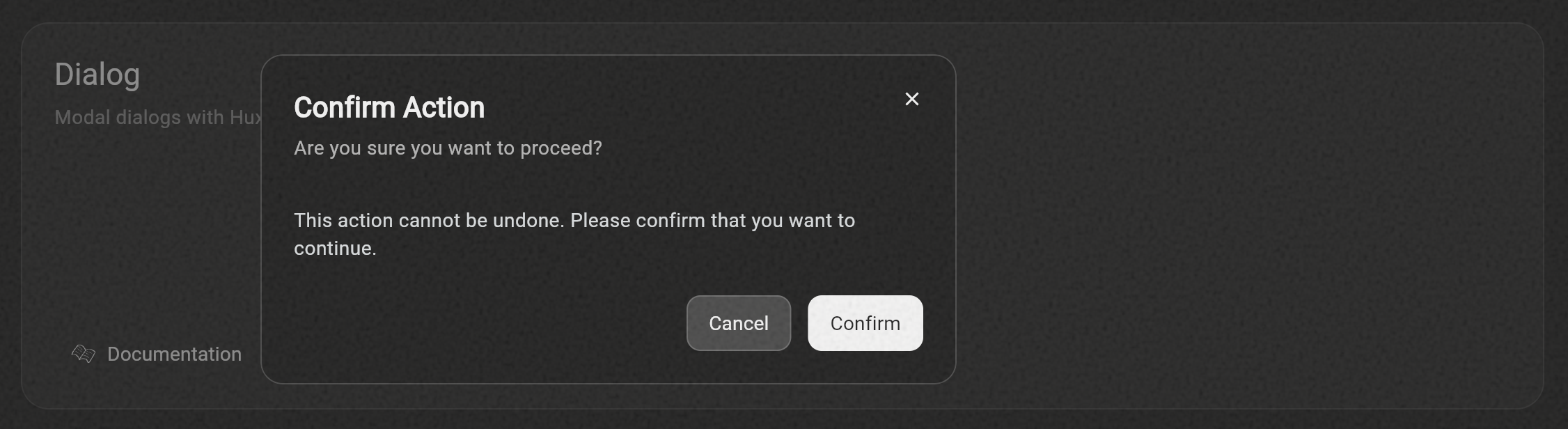
HuxDialog- General-purpose dialog with modern design and multiple size variants
Date & Time Pickers
showHuxDatePickerDialog- Modern date picker with month/year selectionshowHuxTimePickerDialog- Clean time picker with hour/minute dropdowns
Widgets
HuxLoading- Customizable loading indicatorsHuxLoadingOverlay- Full-screen loading overlay
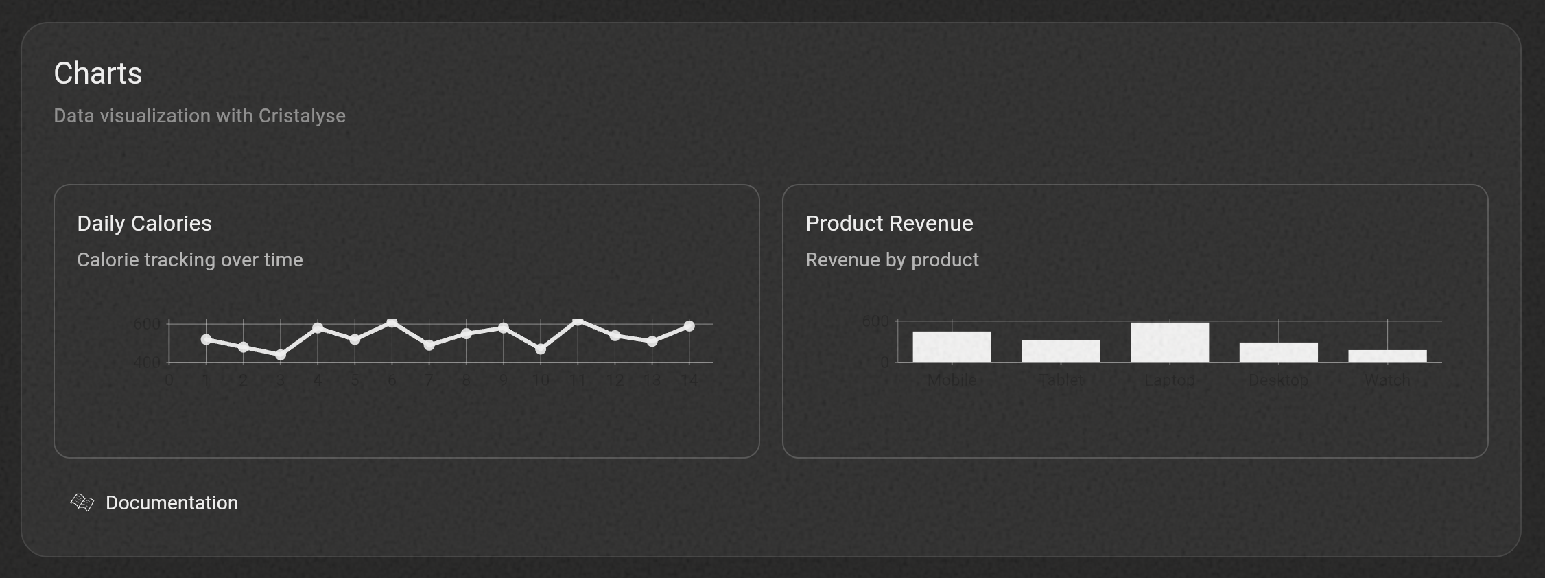
HuxChart- Beautiful data visualization with line and bar charts
Context Menu
HuxContextMenu- Right-click context menus with smart positioningHuxContextMenuItem- Individual menu items with icons and statesHuxContextMenuDivider- Visual separators for menu groups
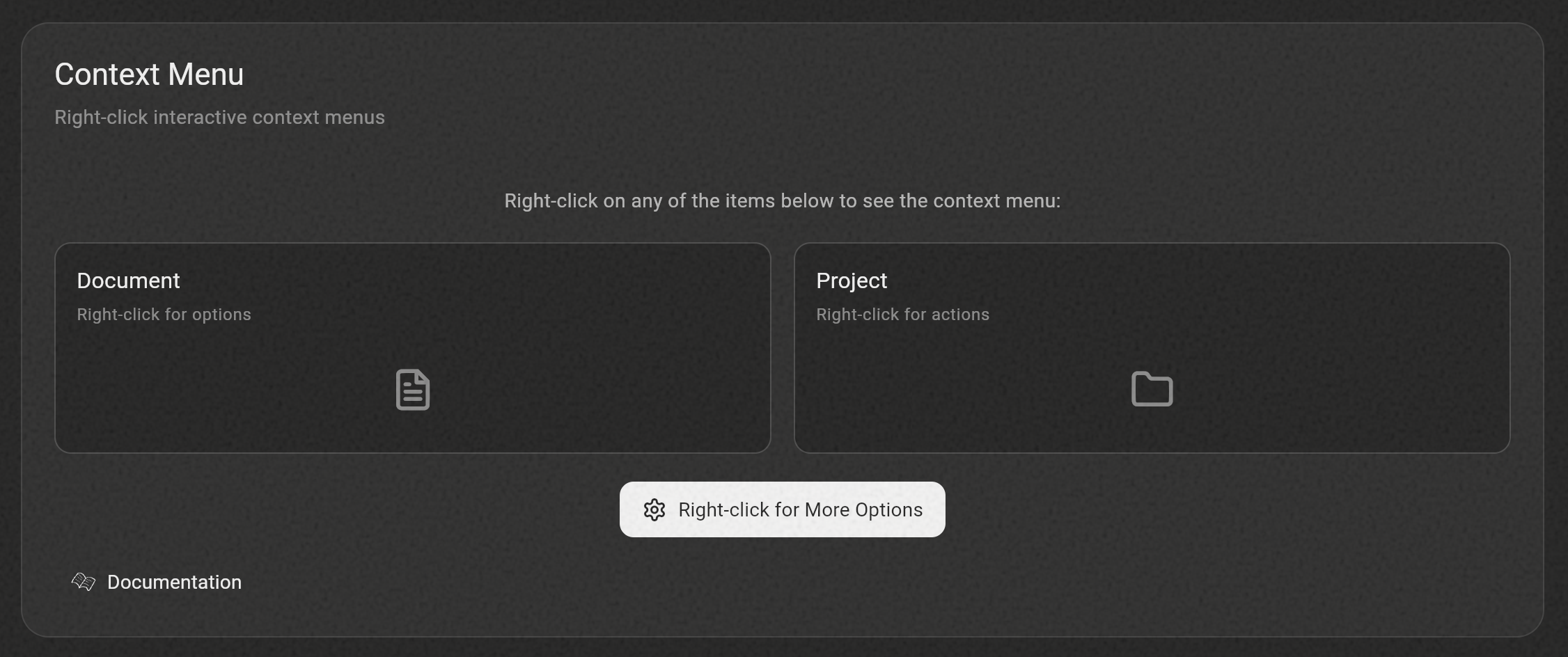
Right-click the example app components to see context menus in action!
Switch
HuxSwitch- Toggle switch with smooth animations between on/off states
Dropdown
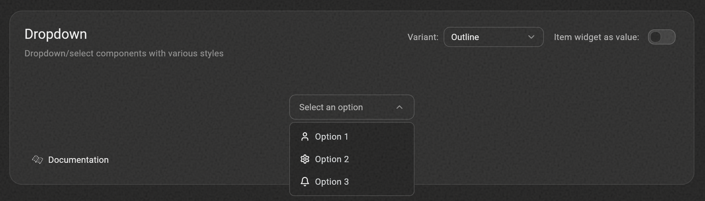
HuxDropdown- Dropdown select component with overlay-based options listHuxDropdownItem- Individual dropdown items with custom content support
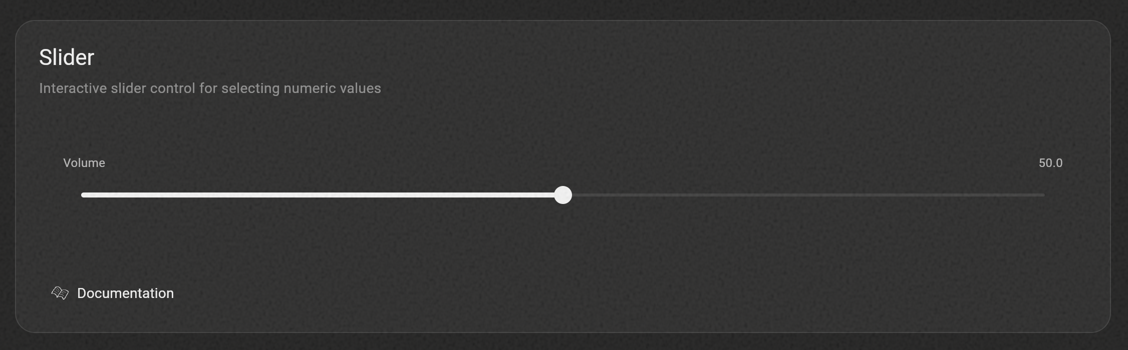
Slider
HuxSlider- Interactive slider control for selecting numeric values within a range
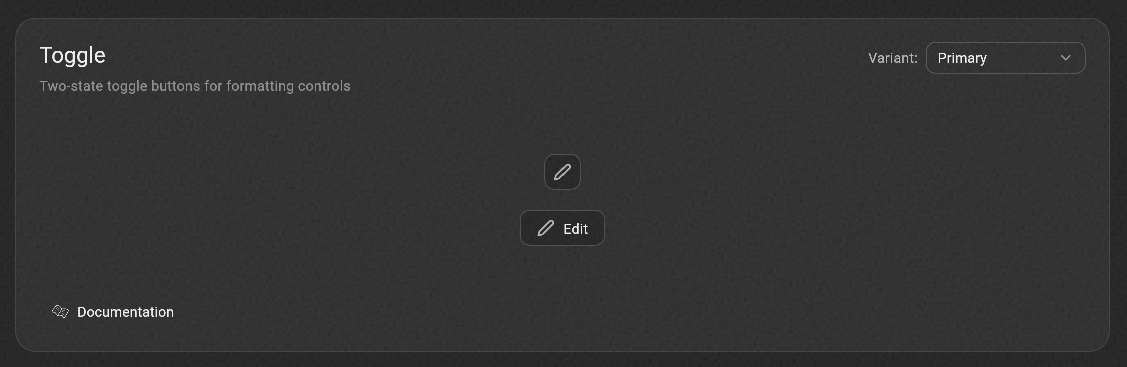
Toggle
HuxToggle- Two-state button toggle for binary controls
Progress
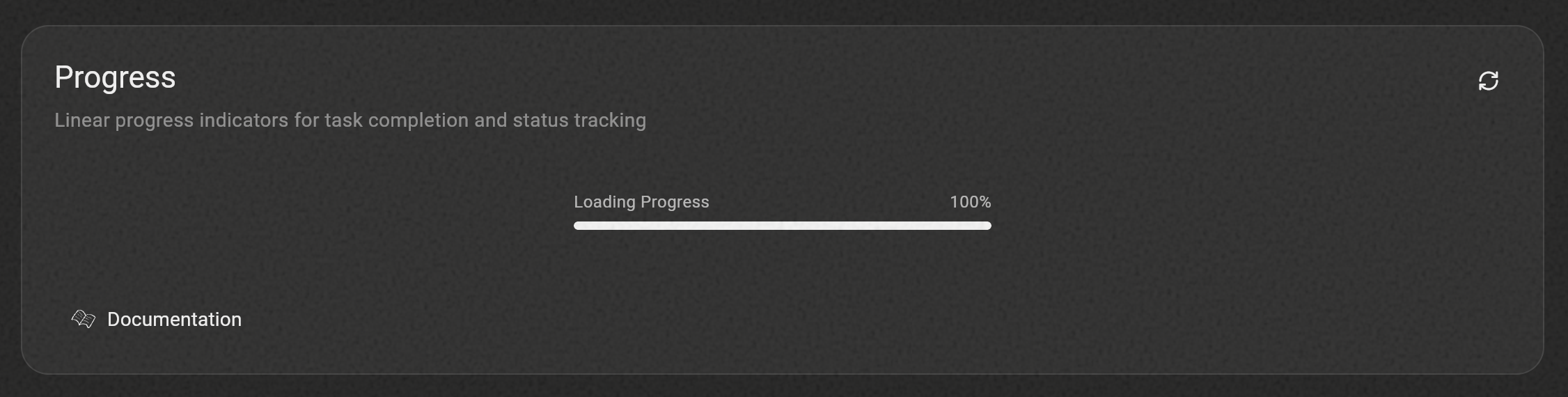
HuxProgress- Linear progress indicator for task completion and status tracking
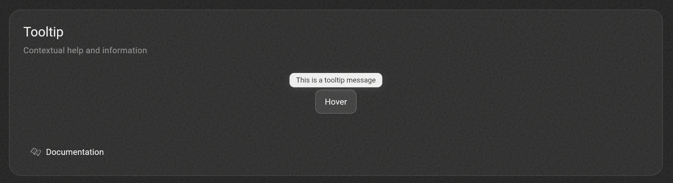
Tooltip
HuxTooltip- Contextual help and information with optional icon support
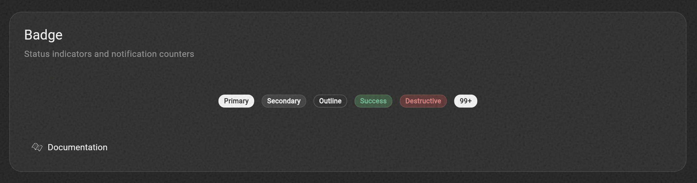
Feedback & Status
HuxBadge- Status indicators and notification counters with semantic variants
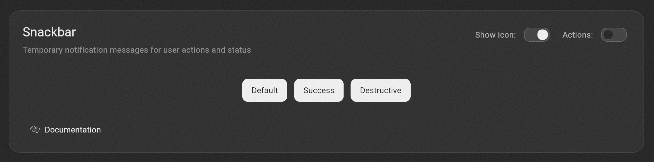
HuxSnackbar- Temporary notification messages with semantic variants (previously HuxAlert)
Avatar
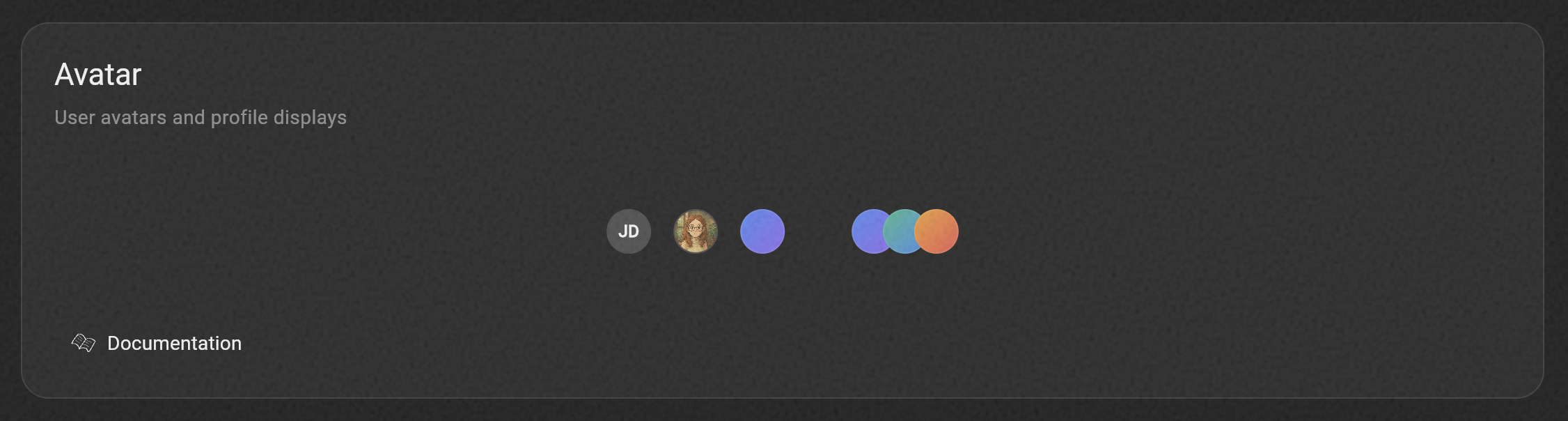
HuxAvatar- Circular user images with initials fallback, custom colors, and beautiful gradient variantsHuxAvatarGroup- Display multiple avatars with overlapping or spaced layouts
Pagination
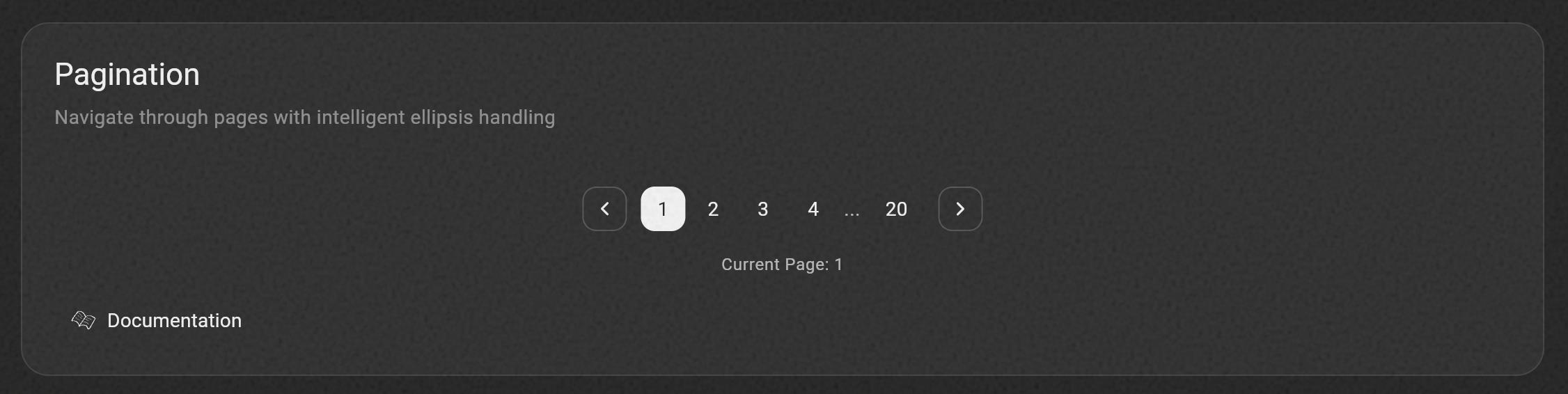
HuxPagination- Navigate through pages with intelligent ellipsis handling (originally contributed by @Kingsley-EZE)
Sidebar
HuxSidebar- Complete navigation sidebar component for app-wide navigationHuxSidebarItem- Individual navigation items with automatic selection state
Breadcrumbs
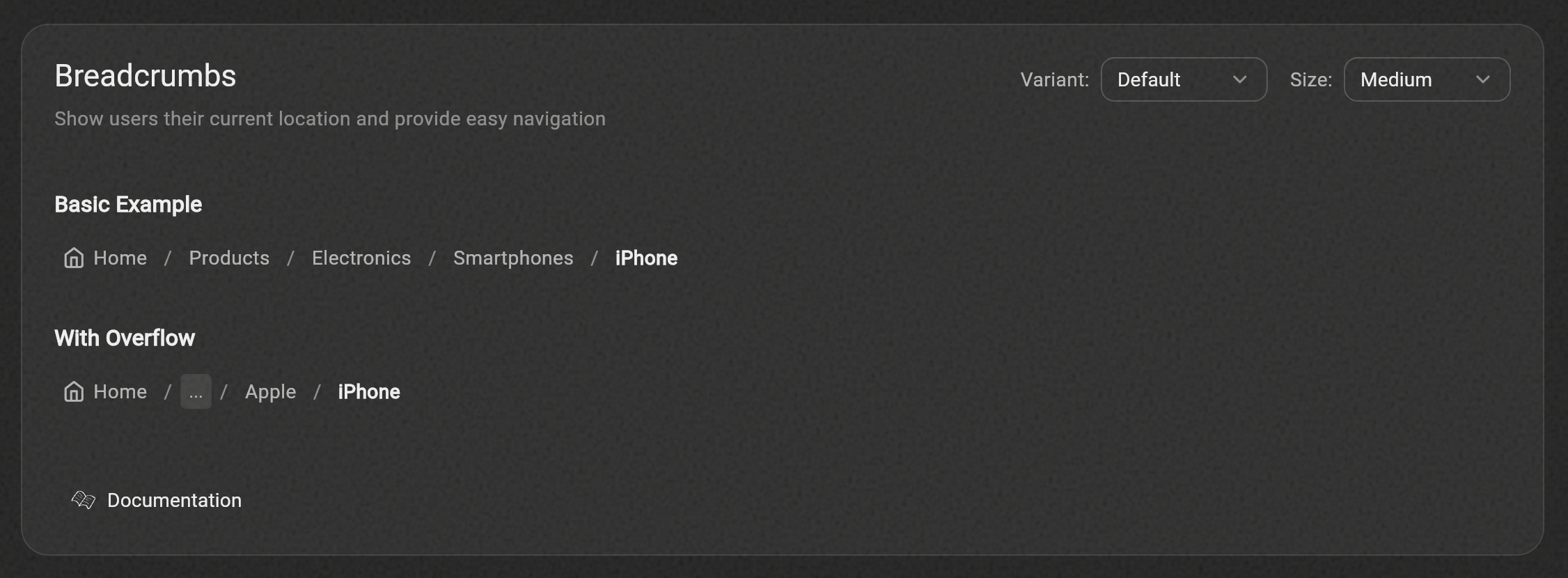
HuxBreadcrumbs- Navigation breadcrumbs showing page hierarchyHuxBreadcrumbItem- Individual breadcrumb with label, icon, and tap handler
Command & Keys
HuxCommand- Powerful command palette for quick access to actions and navigationHuxKBD- Beautiful keyboard key component for shortcuts and UI indicators- Global keyboard shortcuts integration with
HuxCommandShortcuts.wrapper
Bottom Sheet
HuxBottomSheet- Mobile-first modal component for menus and contentHuxActionSheet- Semantic alternative to context menus for mobile
Theme
HuxTheme- Pre-configured light and dark themes with Material 3 seed color supportHuxColors- Comprehensive color paletteHuxTokens- Semantic design tokens that adapt to custom themes
Documentation
📚 Complete Documentation - Visit our comprehensive documentation site for detailed guides, API references, and examples.
🎨 Figma Library - Access the complete Hux UI design system in Figma with all components, colors, and design tokens.
✨ Recently Updated: Our documentation has been completely restructured with individual pages for each component, alphabetical navigation, and improved clarity!
Quick Links
Usage
Basic Setup
Wrap your app with the Hux theme:
import 'package:flutter/material.dart';
import 'package:hux/hux.dart';

void main() {
  runApp(MyApp());
}

class MyApp extends StatelessWidget {
  @override
  Widget build(BuildContext context) {
    return MaterialApp(
      title: 'Hux UI Demo',
      theme: HuxTheme.lightTheme,
      darkTheme: HuxTheme.darkTheme,
      home: MyHomePage(),
    );
  }
}
Using Components
Button
HuxButton(
  onPressed: () => print('Button pressed'),
  child: Text('Primary Button'),
  variant: HuxButtonVariant.primary,
  size: HuxButtonSize.medium,
  icon: Icons.star,
)
Text Field
HuxInput(
  label: 'Email',
  hint: 'Enter your email',
  prefixIcon: Icon(Icons.email),
  onChanged: (value) => print(value),
  validator: (value) {
    if (value == null || value.isEmpty) {
      return 'Please enter your email';
    }
    return null;
  },
)
Textarea
HuxTextarea(
  label: 'Description',
  hint: 'Enter a description...',
  minLines: 3,
  maxLines: 6,
  maxLength: 500,
  showCharacterCount: true,
  validator: (value) {
    if (value == null || value.isEmpty) {
      return 'Please enter a description';
    }
    return null;
  },
)
OTP Input
HuxOtpInput(
  length: 6,
  label: 'Verification Code',
  helperText: 'Enter the 6-digit code sent to your email',
  onChanged: (value) => print('OTP: $value'),
  onCompleted: (value) => verifyCode(value),
)
Card
HuxCard(
  title: 'Card Title',
  subtitle: 'Card subtitle',
  action: IconButton(
    icon: Icon(Icons.more_vert),
    onPressed: () {},
  ),
  child: Text('Card content goes here'),
  onTap: () => print('Card tapped'),
)
Dialog
// Basic dialog
showHuxDialog(
  context: context,
  title: 'Confirm Action',
  content: Text('Are you sure you want to proceed?'),
  actions: [
    HuxButton(
      onPressed: () => Navigator.of(context).pop(false),
      variant: HuxButtonVariant.secondary,
      child: Text('Cancel'),
    ),
    HuxButton(
      onPressed: () => Navigator.of(context).pop(true),
      child: Text('Confirm'),
    ),
  ],
);
Date & Time Pickers
// Date picker
final DateTime? selectedDate = await showHuxDatePickerDialog(
  context: context,
  initialDate: DateTime.now(),
  firstDate: DateTime(2020),
  lastDate: DateTime(2030),
);

// Time picker
final TimeOfDay? selectedTime = await showHuxTimePickerDialog(
  context: context,
  initialTime: TimeOfDay.now(),
);
Loading
// Simple loading indicator
HuxLoading(size: HuxLoadingSize.medium)

// Loading overlay
HuxLoadingOverlay(
  isLoading: true,
  message: 'Loading...',
  child: YourContent(),
)
Charts
// Line chart
HuxChart.line(
  data: [
    {'x': 1, 'y': 10},
    {'x': 2, 'y': 20},
    {'x': 3, 'y': 15},
  ],
  xField: 'x',
  yField: 'y',
  title: 'Sales Over Time',
  subtitle: 'Monthly data',
  primaryColor: Colors.blue,
)

// Bar chart
HuxChart.bar(
  data: [
    {'category': 'A', 'value': 30},
    {'category': 'B', 'value': 45},
    {'category': 'C', 'value': 25},
  ],
  xField: 'category',
  yField: 'value',
  title: 'Category Analysis',
)
Context Menu
HuxContextMenu(
  menuItems: [
    HuxContextMenuItem(
      text: 'Copy',
      icon: FeatherIcons.copy,
      onTap: () => print('Copy action'),
    ),
    HuxContextMenuItem(
      text: 'Paste',
      icon: FeatherIcons.clipboard,
      onTap: () => print('Paste action'),
      isDisabled: true,
    ),
    const HuxContextMenuDivider(),
    HuxContextMenuItem(
      text: 'Delete',
      icon: FeatherIcons.trash2,
      onTap: () => print('Delete action'),
      isDestructive: true,
    ),
  ],
  child: Container(
    padding: const EdgeInsets.all(20),
    child: const Text('Right-click me!'),
  ),
)
Dropdown
HuxDropdown<String>(
  value: selectedValue,
  placeholder: 'Select an option',
  items: [
    HuxDropdownItem(value: 'option1', child: Text('Option 1')),
    HuxDropdownItem(value: 'option2', child: Text('Option 2')),
    HuxDropdownItem(value: 'option3', child: Text('Option 3')),
  ],
  onChanged: (value) => setState(() => selectedValue = value),
  variant: HuxButtonVariant.outline,
  size: HuxButtonSize.medium,
)
Toggle
// Icon-only toggle (e.g., for formatting controls)
HuxToggle(
  value: isBold,
  onChanged: (value) => setState(() => isBold = value),
  icon: Icons.format_bold,
  semanticLabel: 'Bold',
  size: HuxToggleSize.medium,
)

// Toggle with label
HuxToggle(
  value: isEnabled,
  onChanged: (value) => setState(() => isEnabled = value),
  icon: Icons.notifications,
  label: 'Notifications',
  variant: HuxButtonVariant.outline,
)
Breadcrumbs
HuxBreadcrumbs(
  items: [
    HuxBreadcrumbItem(
      label: 'Home',
      onTap: () => Navigator.popUntil(context, (route) => route.isFirst),
      icon: Icons.home,
    ),
    HuxBreadcrumbItem(
      label: 'Products',
      onTap: () => Navigator.pushNamed(context, '/products'),
    ),
    HuxBreadcrumbItem(
      label: 'Details',
      onTap: () {},
      isActive: true,
    ),
  ],
  variant: HuxBreadcrumbVariant.icon,
  size: HuxBreadcrumbSize.medium,
)
Avatar & Avatar Group
// Simple avatar with initials
HuxAvatar(
  name: 'John Doe',
  size: HuxAvatarSize.medium,
)

// Gradient avatar
HuxAvatar(
  useGradient: true,
  gradientVariant: HuxAvatarGradient.bluePurple,
  size: HuxAvatarSize.medium,
)

// Avatar group with overlap
HuxAvatarGroup(
  avatars: [
    HuxAvatar(name: 'Alice'),
    HuxAvatar(name: 'Bob'),
    HuxAvatar(useGradient: true, gradientVariant: HuxAvatarGradient.greenBlue),
  ],
  overlap: true,
  maxVisible: 3,
)
Progress
// Basic progress indicator
HuxProgress(value: 0.5)

// Progress with label and value display
HuxProgress(
  value: 0.75,
  label: 'Uploading files',
  showValue: true,
  variant: HuxProgressVariant.primary,
)

// Success variant for completed tasks
HuxProgress(
  value: 1.0,
  label: 'Complete',
  variant: HuxProgressVariant.success,
  showValue: true,
)
Tooltip
// Basic tooltip
HuxTooltip(
  message: 'This is a helpful tooltip',
  child: Icon(Icons.info),
)

// Tooltip with icon and custom positioning
HuxTooltip(
  message: 'Information about this feature',
  icon: Icons.info_outline,
  preferBelow: false,
  verticalOffset: 16.0,
  child: HuxButton(
    onPressed: () {},
    variant: HuxButtonVariant.outline,
    child: Text('Hover me'),
  ),
)
Badges & Snackbars
// Badge variants
HuxBadge(
  label: 'New',
  variant: HuxBadgeVariant.primary,
  size: HuxBadgeSize.small,
)

// Snackbar using extension method (recommended)
context.showHuxSnackbar(
  message: 'Operation completed successfully',
  variant: HuxSnackbarVariant.success,
  title: 'Success!',
)

// Snackbar with custom duration
context.showHuxSnackbar(
  message: 'File saved',
  variant: HuxSnackbarVariant.info,
  duration: Duration(seconds: 2),
)

// Alert with dismissal (deprecated, use Snackbar instead)
HuxAlert(
  variant: HuxAlertVariant.success,
  title: 'Success!',
  message: 'Operation completed successfully.',
  showIcon: true,
  onDismiss: () => print('Alert dismissed'),
)
Command Palette & Keyboard Keys
// HuxKBD for individual keys
HuxKBD(shortcut: '⌘K')

// Define your commands
final commands = [
  HuxCommandItem(
    id: 'toggle-theme',
    label: 'Toggle Theme',
    description: 'Switch between light and dark mode',
    shortcut: '⌘⇧T',
    icon: LucideIcons.sun,
    category: 'View',
    onExecute: () => print('Theme toggled'),
  ),
  HuxCommandItem(
    id: 'settings',
    label: 'Settings',
    description: 'Open application settings',
    shortcut: '⌘,',
    icon: LucideIcons.settings,
    category: 'Preferences',
    onExecute: () => print('Settings opened'),
  ),
];

// Show the command palette
showHuxCommand(
  context: context,
  commands: commands,
  placeholder: 'Type a command or search...',
  onCommandSelected: (command) {
    print('Selected: ${command.label}');
  },
);

// Or wrap your app for global shortcuts
HuxCommandShortcuts.wrapper(
  commands: commands,
  child: MaterialApp(
    home: MyHomePage(),
  ),
)
Bottom Sheet
showHuxBottomSheet(
  context: context,
  title: 'Settings',
  subtitle: 'Customize your preferences',
  size: HuxBottomSheetSize.medium,
  child: Column(
    children: [
      ListTile(title: Text('Notifications')),
      ListTile(title: Text('Privacy')),
    ],
  ),
  actions: [
    HuxButton(
      onPressed: () => Navigator.pop(context),
      variant: HuxButtonVariant.secondary,
      child: Text('Cancel'),
    ),
    HuxButton(
      onPressed: () => Navigator.pop(context),
      child: Text('Save'),
    ),
  ],
);
Action Sheet
showHuxActionSheet(
  context: context,
  title: 'Share Photo',
  actions: [
    HuxActionSheetItem(
      label: 'Save to Gallery',
      icon: LucideIcons.download,
      onTap: () => print('Saved'),
    ),
    HuxActionSheetItem(
      label: 'Share',
      icon: LucideIcons.share2,
      onTap: () => print('Shared'),
    ),
    HuxActionSheetItem(
      label: 'Delete',
      icon: LucideIcons.trash2,
      isDestructive: true,
      onTap: () => print('Deleted'),
    ),
  ],
);
Customization
All components can be customized using the provided parameters. For more advanced customization, you can extend the theme or override specific component styles.
Custom Colors
// Access predefined colors
Container(
  color: HuxColors.primary,
  child: Text('Primary colored container'),
)
Support
If you find Hux UI helpful and would like to support its continued development, consider becoming a GitHub Sponsor! 🌟

Your support helps us:
- Maintain and improve Hux UI components
- Create better documentation and examples
- Fix bugs and add new features faster
- Invest in new component development
Thank you to all our sponsors! Your contributions make a real difference in the Flutter community.
Contributing
Contributions are welcome! Please feel free to submit a Pull Request.
Fonts & Third-Party Licenses
Manrope Font
Hux UI uses the Manrope font family, licensed under the SIL Open Font License, Version 1.1.
Copyright 2018 The Manrope Project Authors (https://github.com/sharanda/manrope)
License
This project is licensed under the MIT License - see the LICENSE file for details.